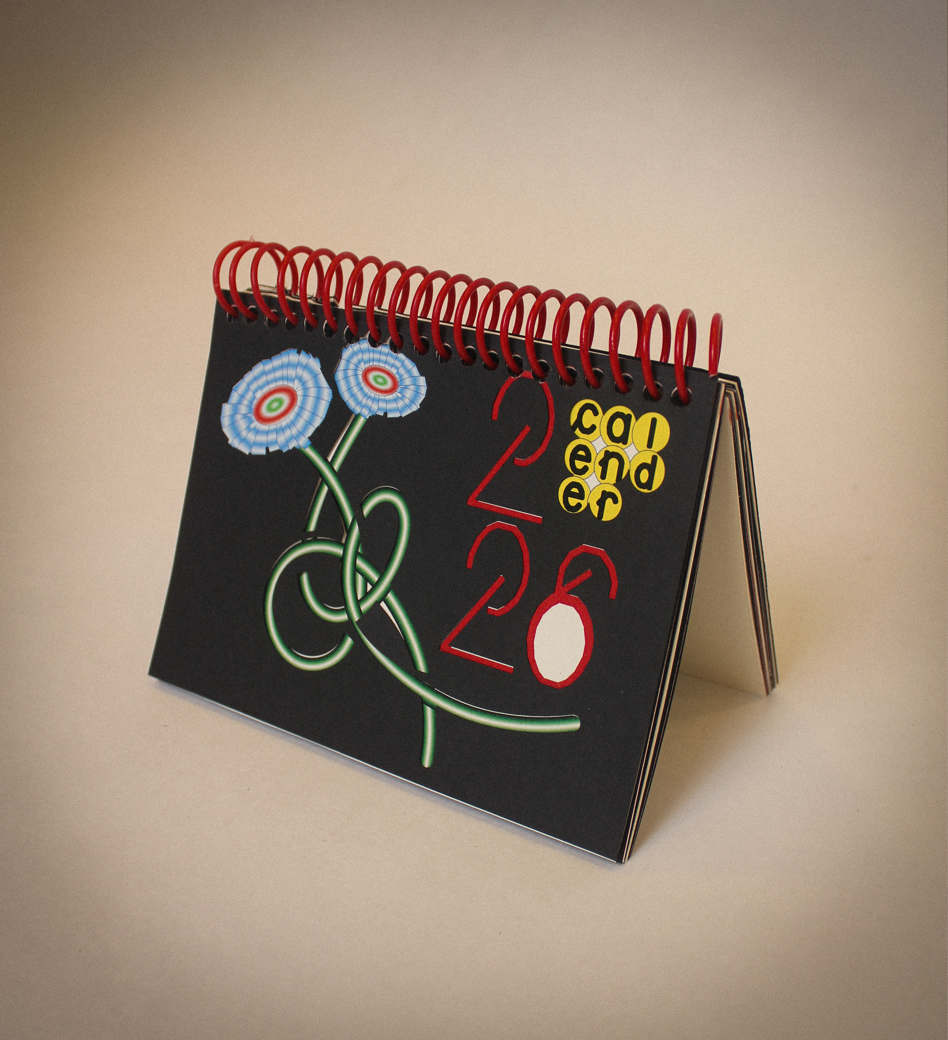
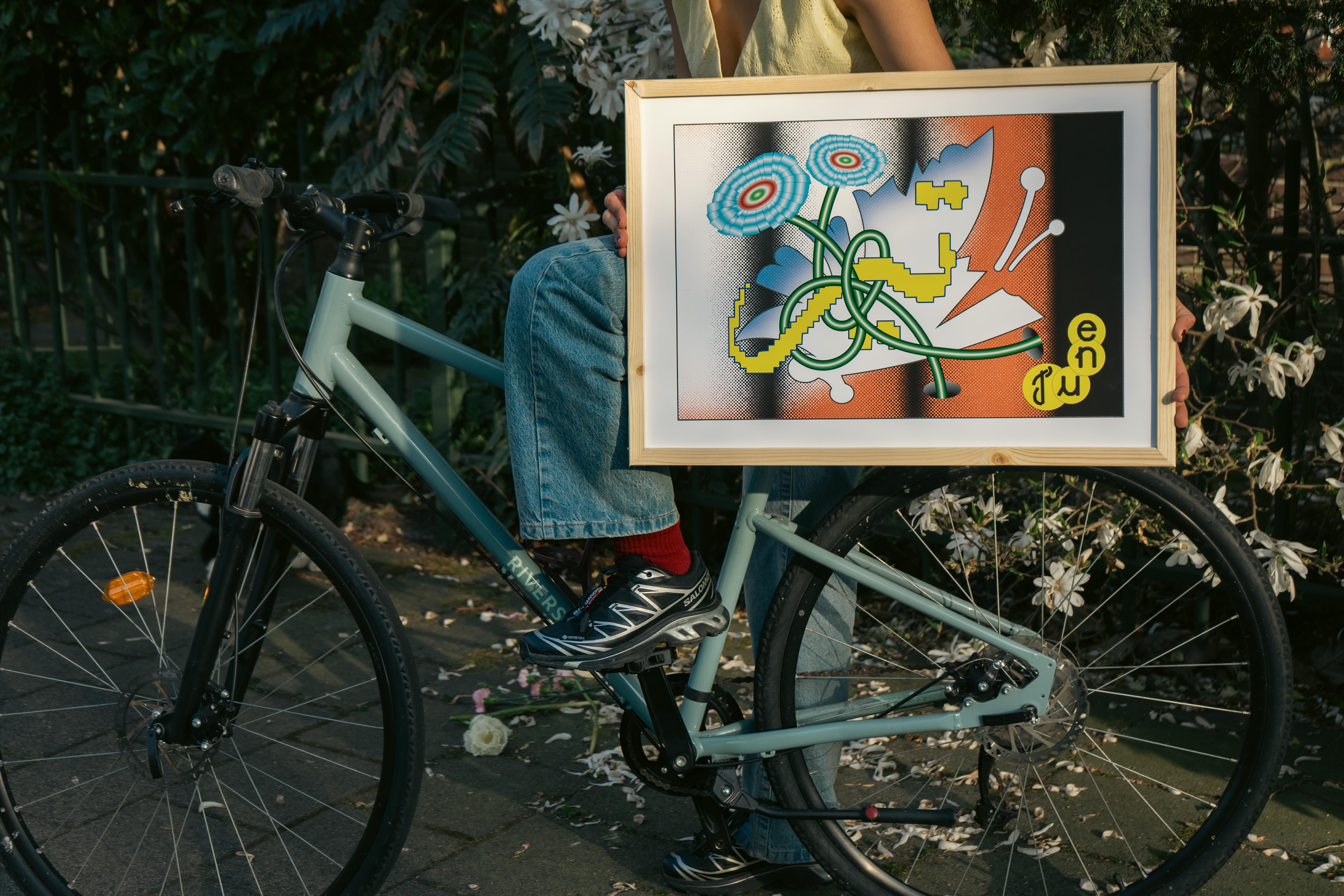
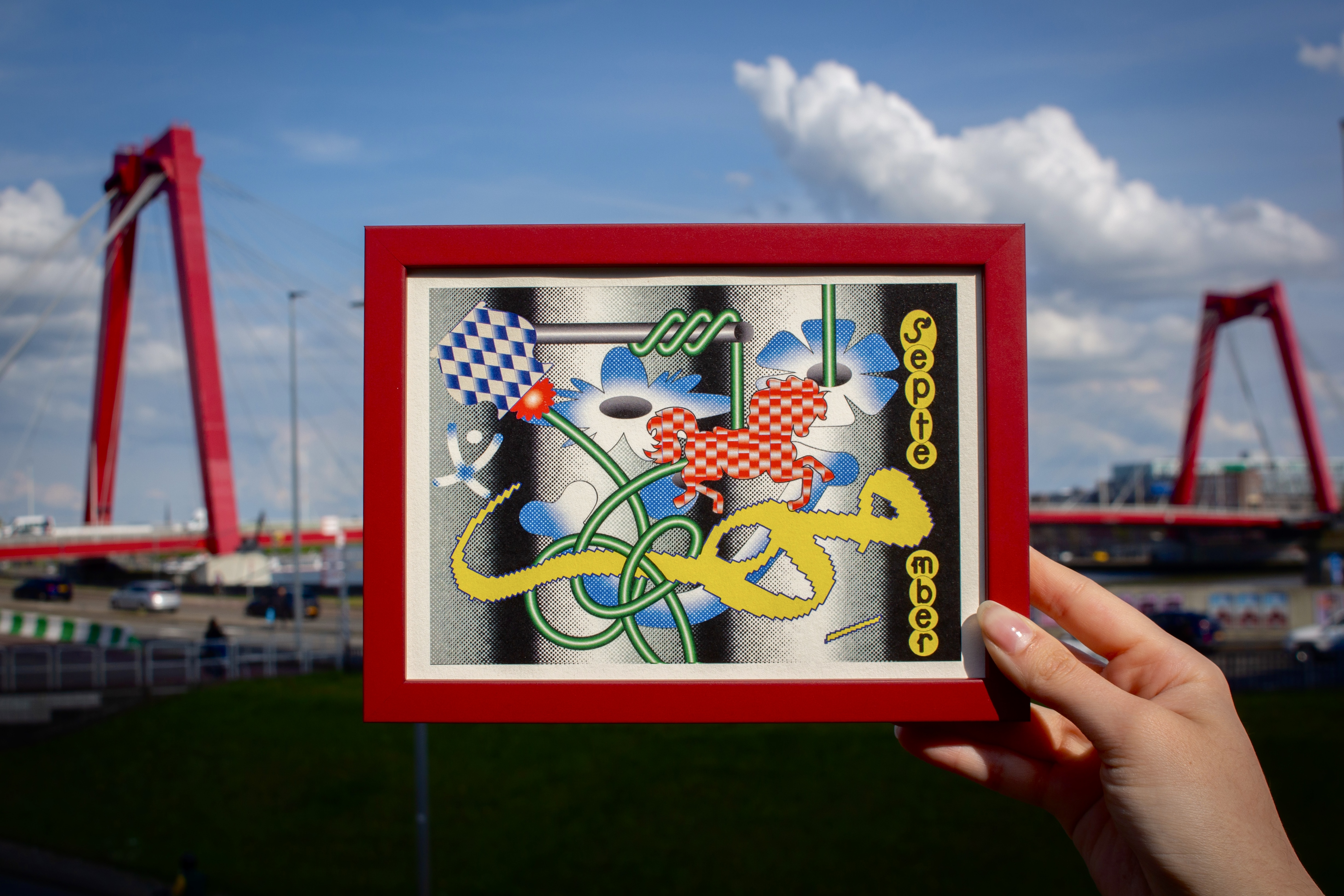
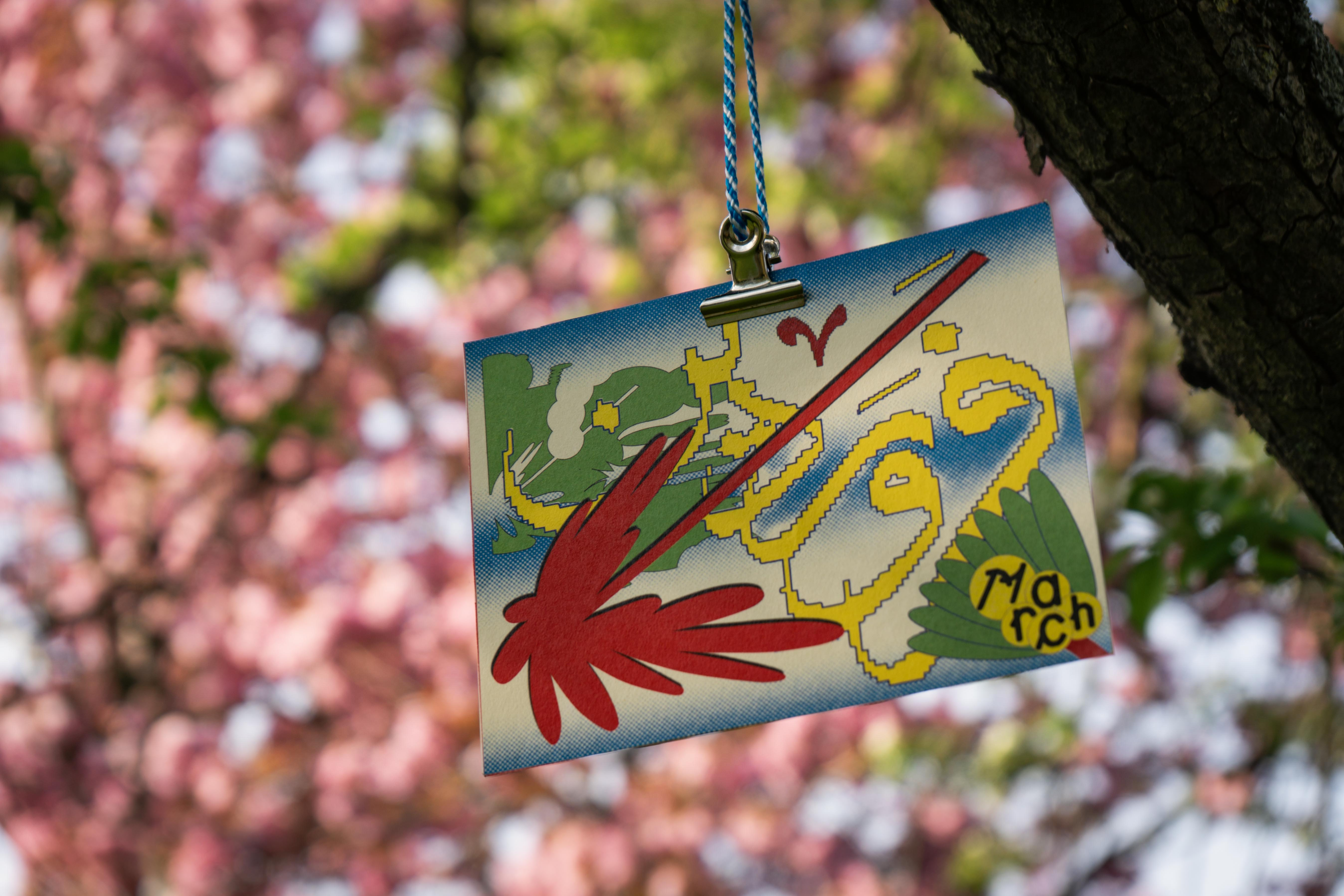
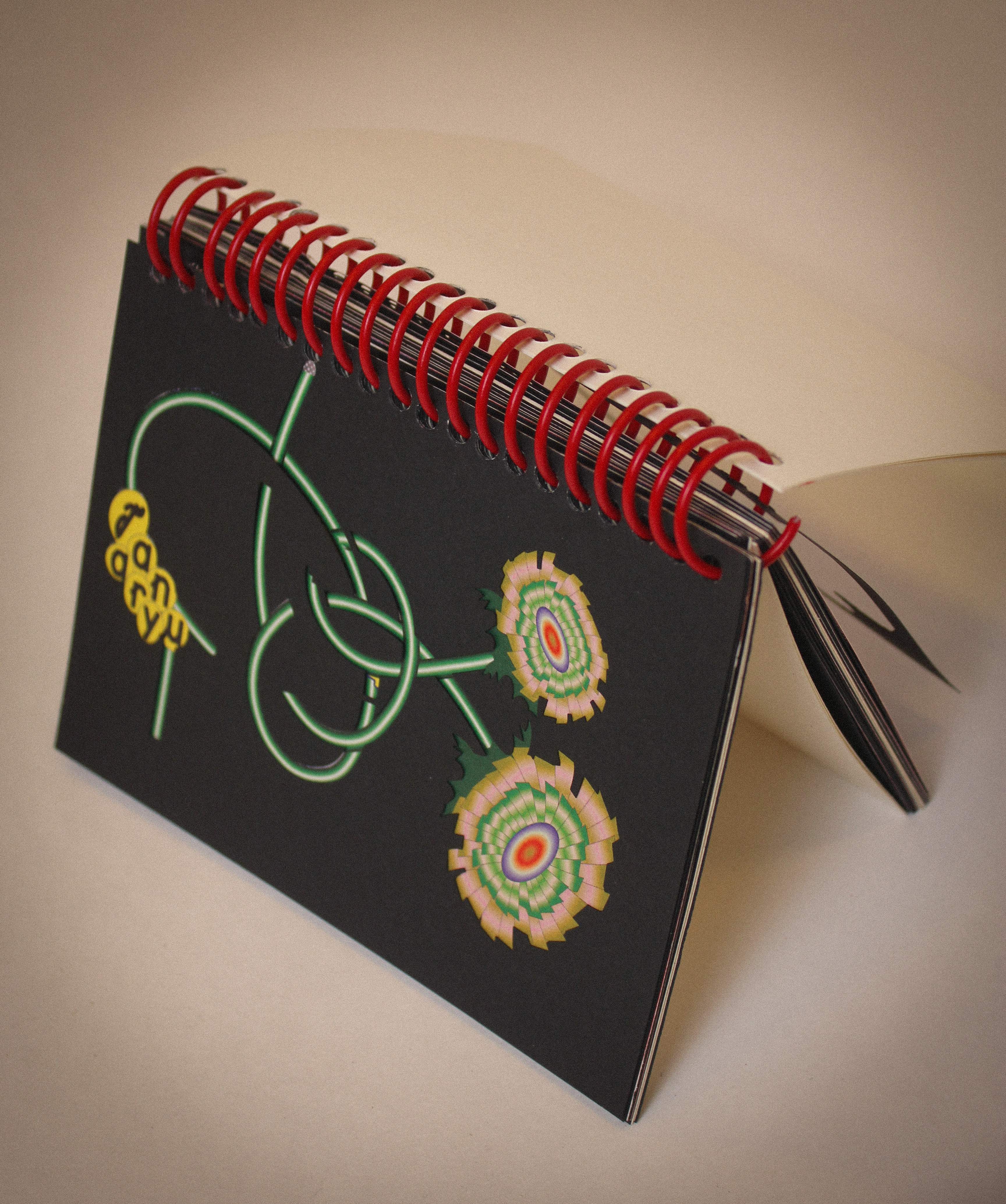
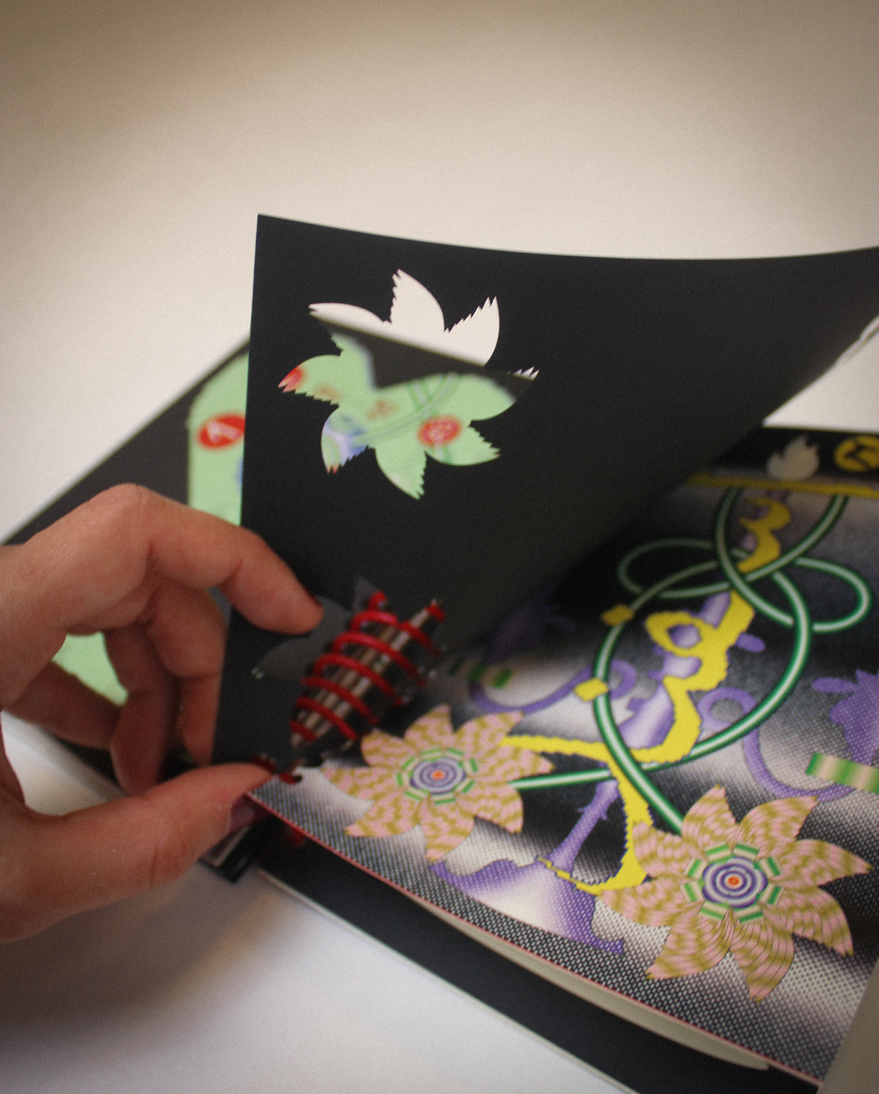
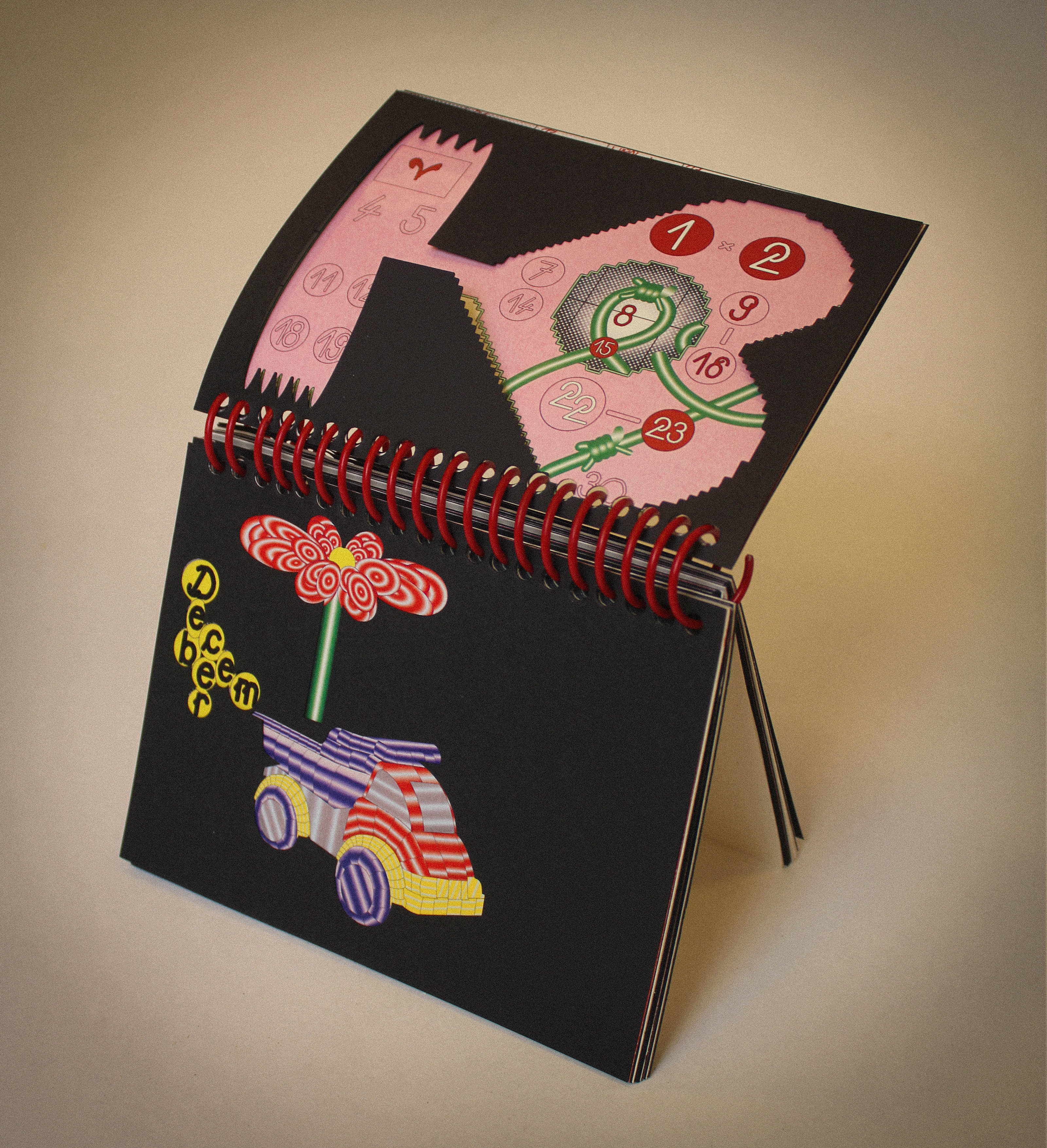
Illustration
cut-out
Typography
Experimental
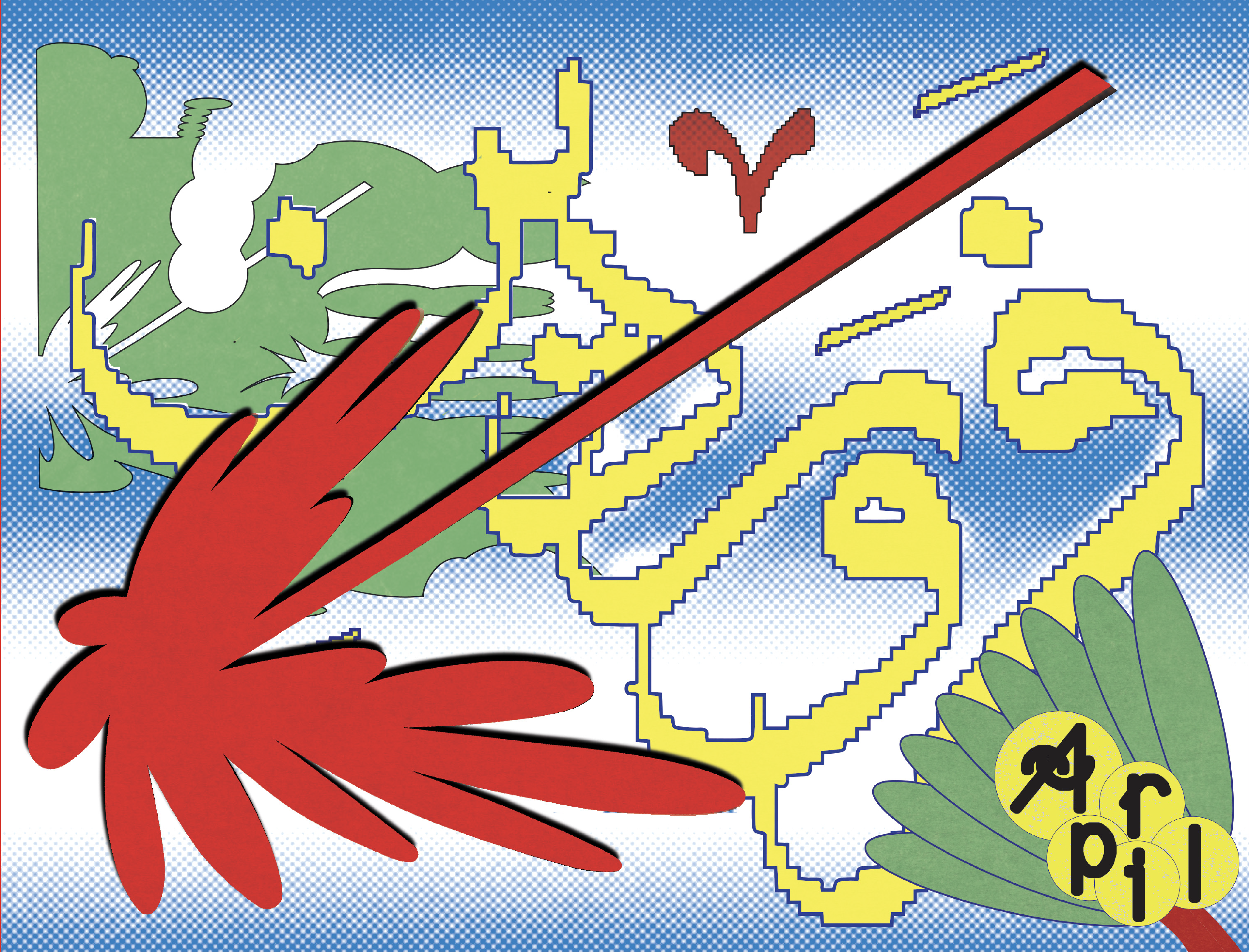
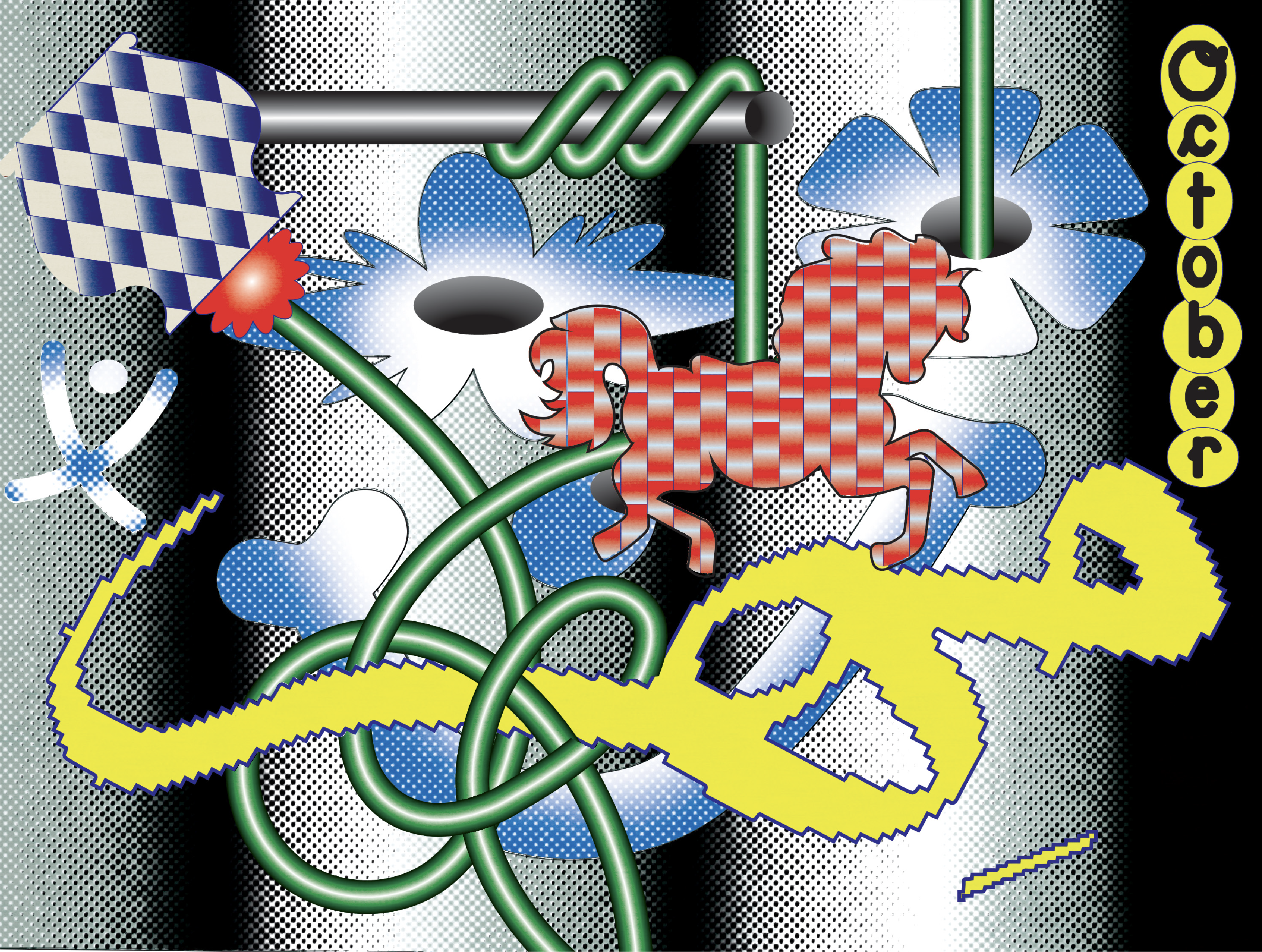
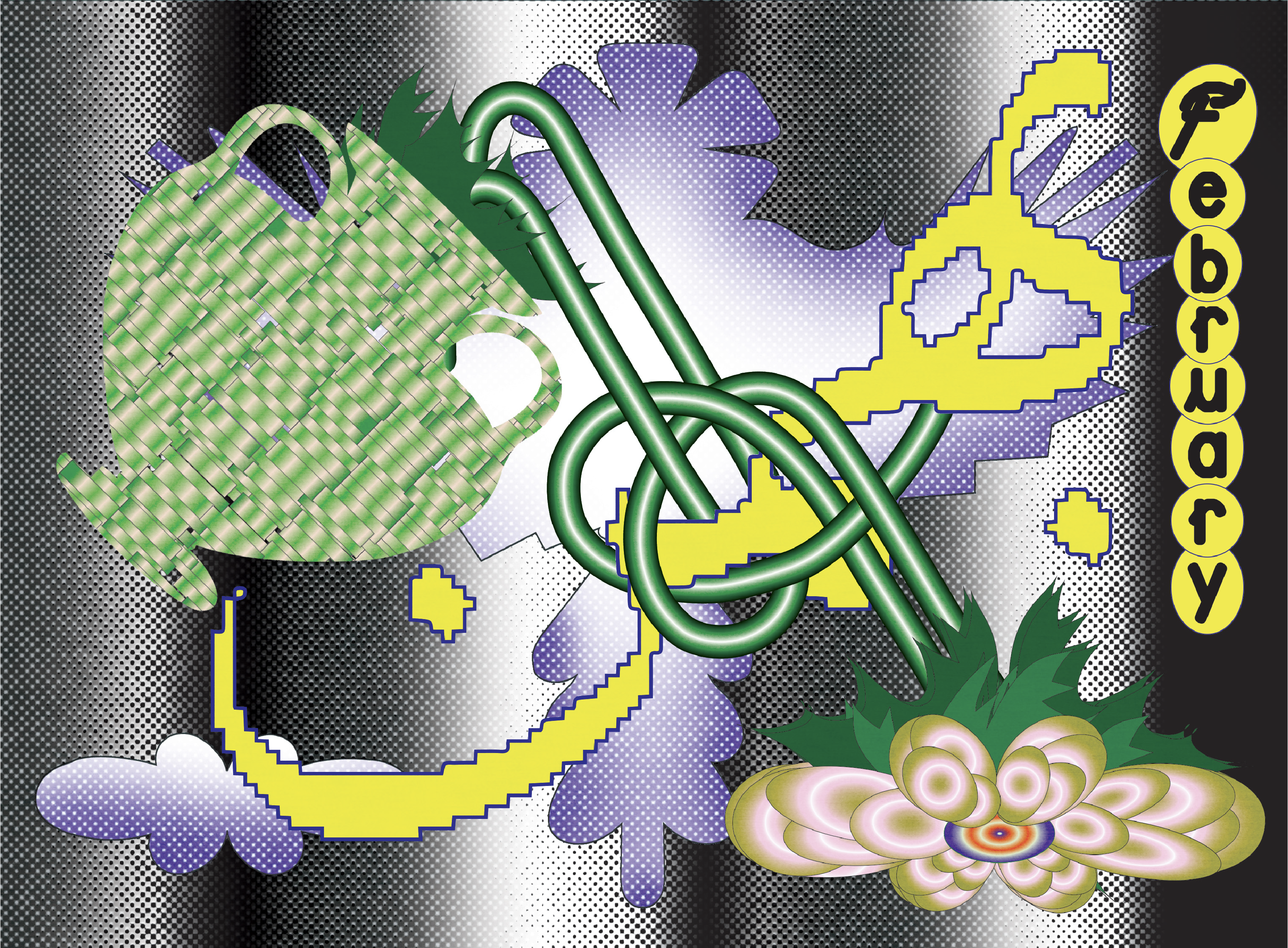
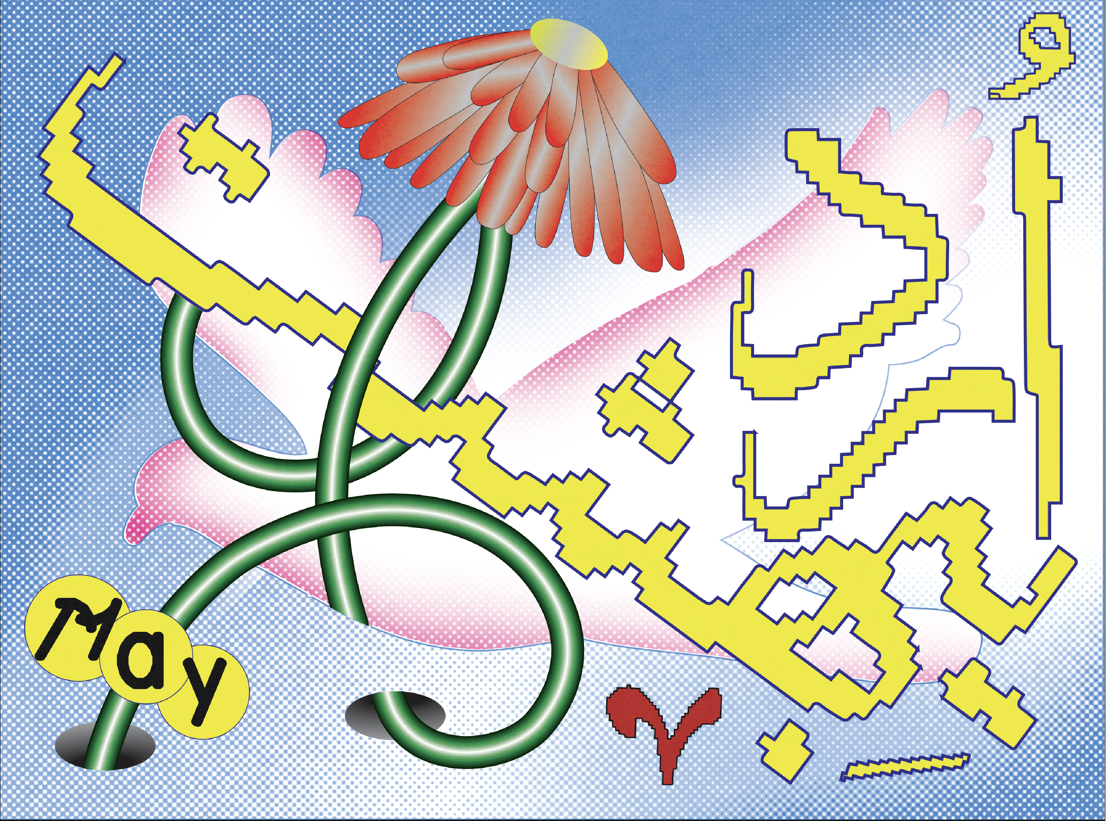
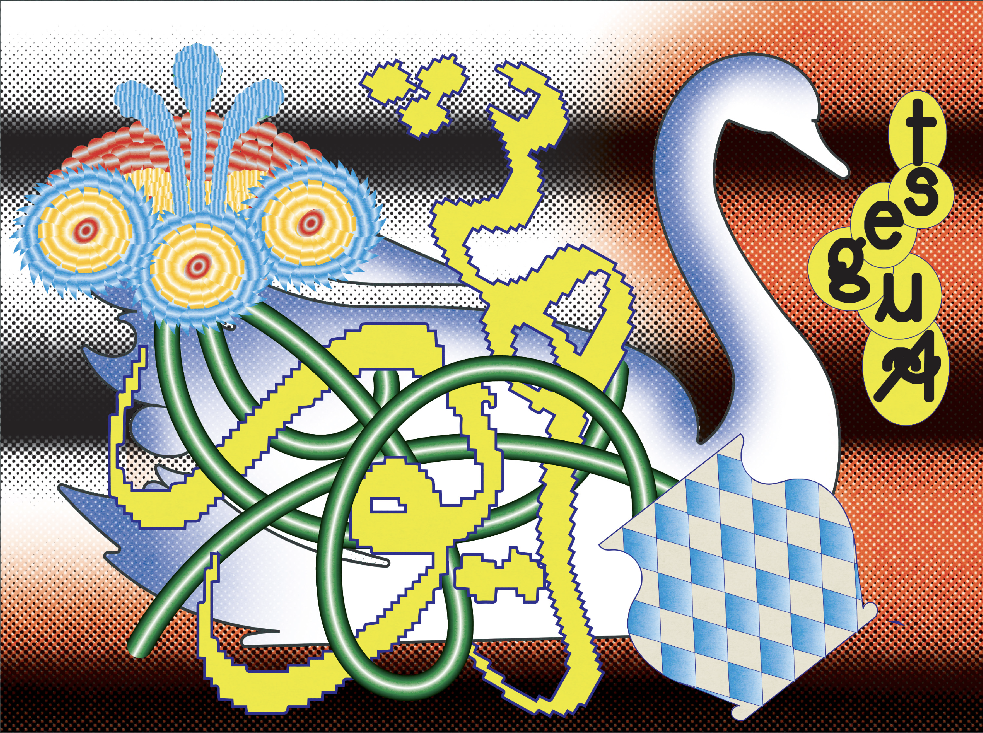
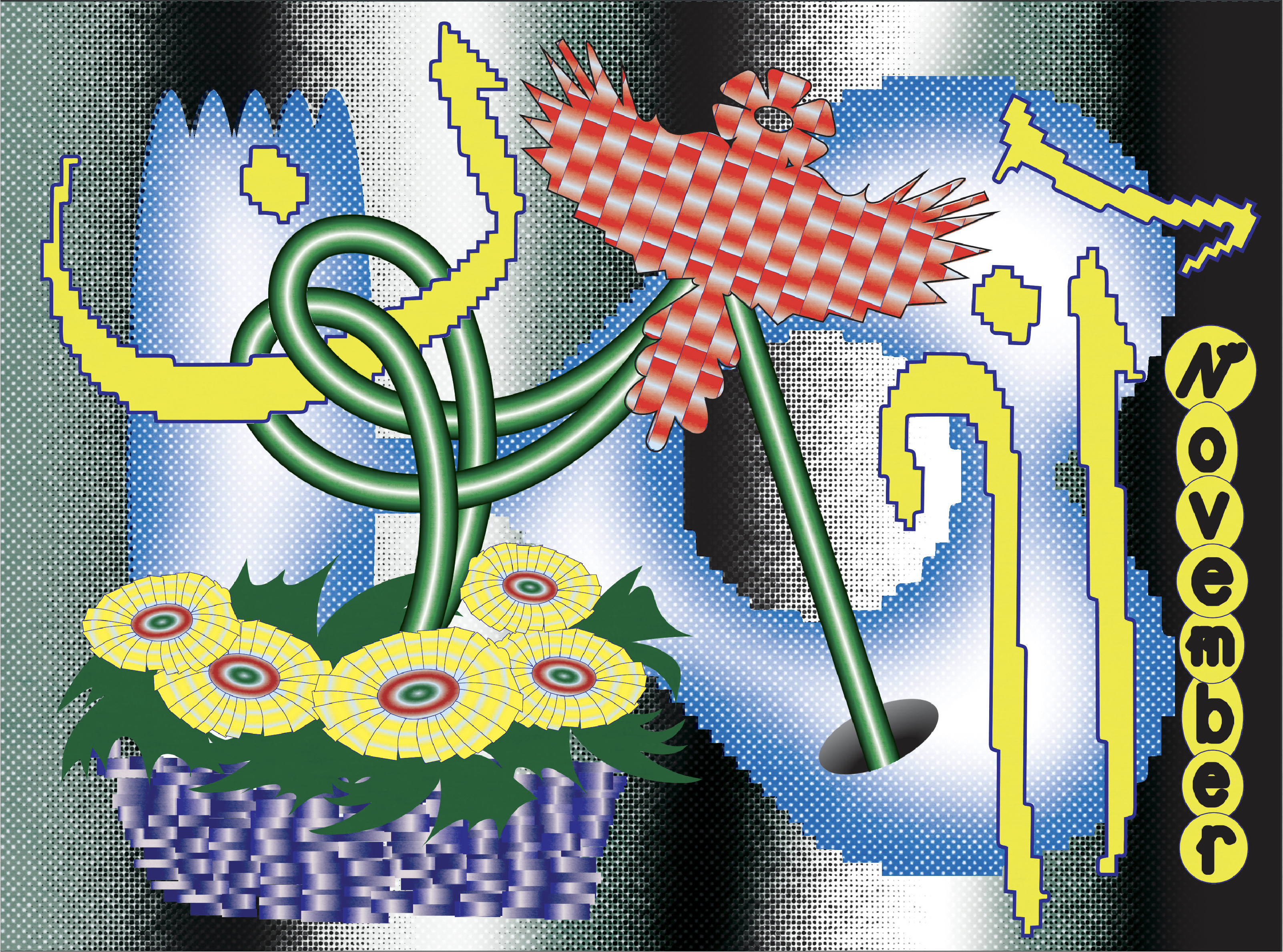
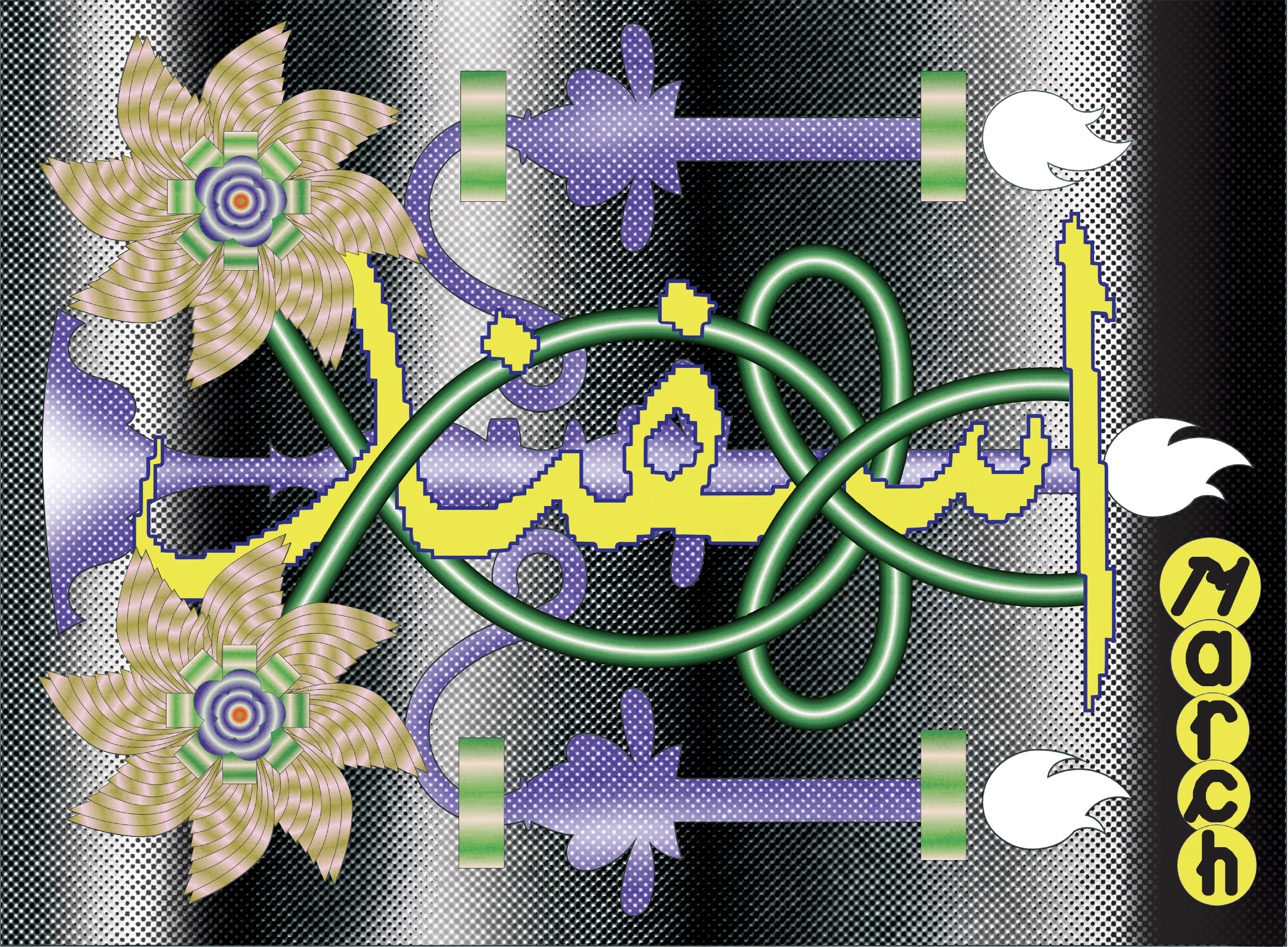
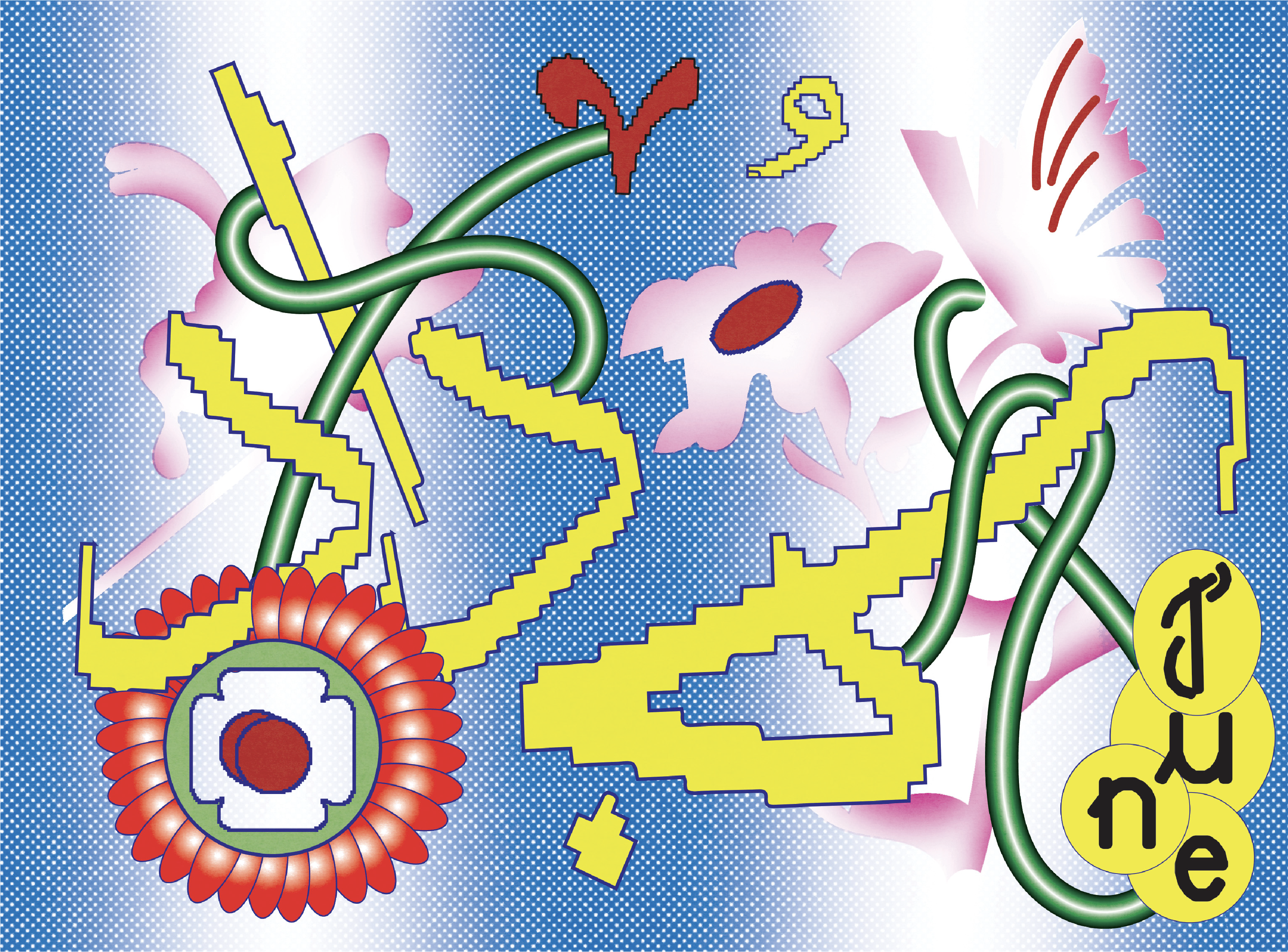
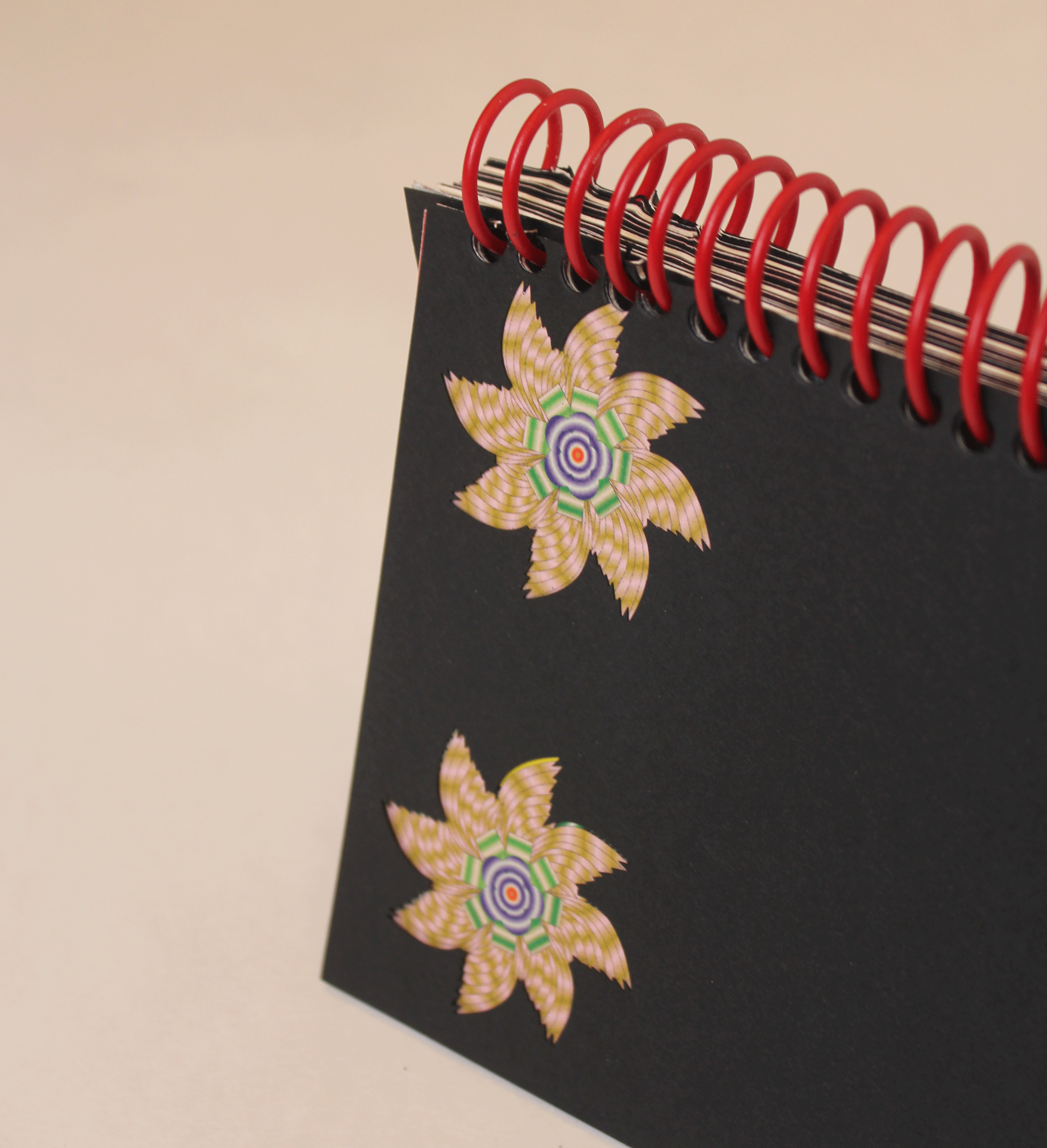
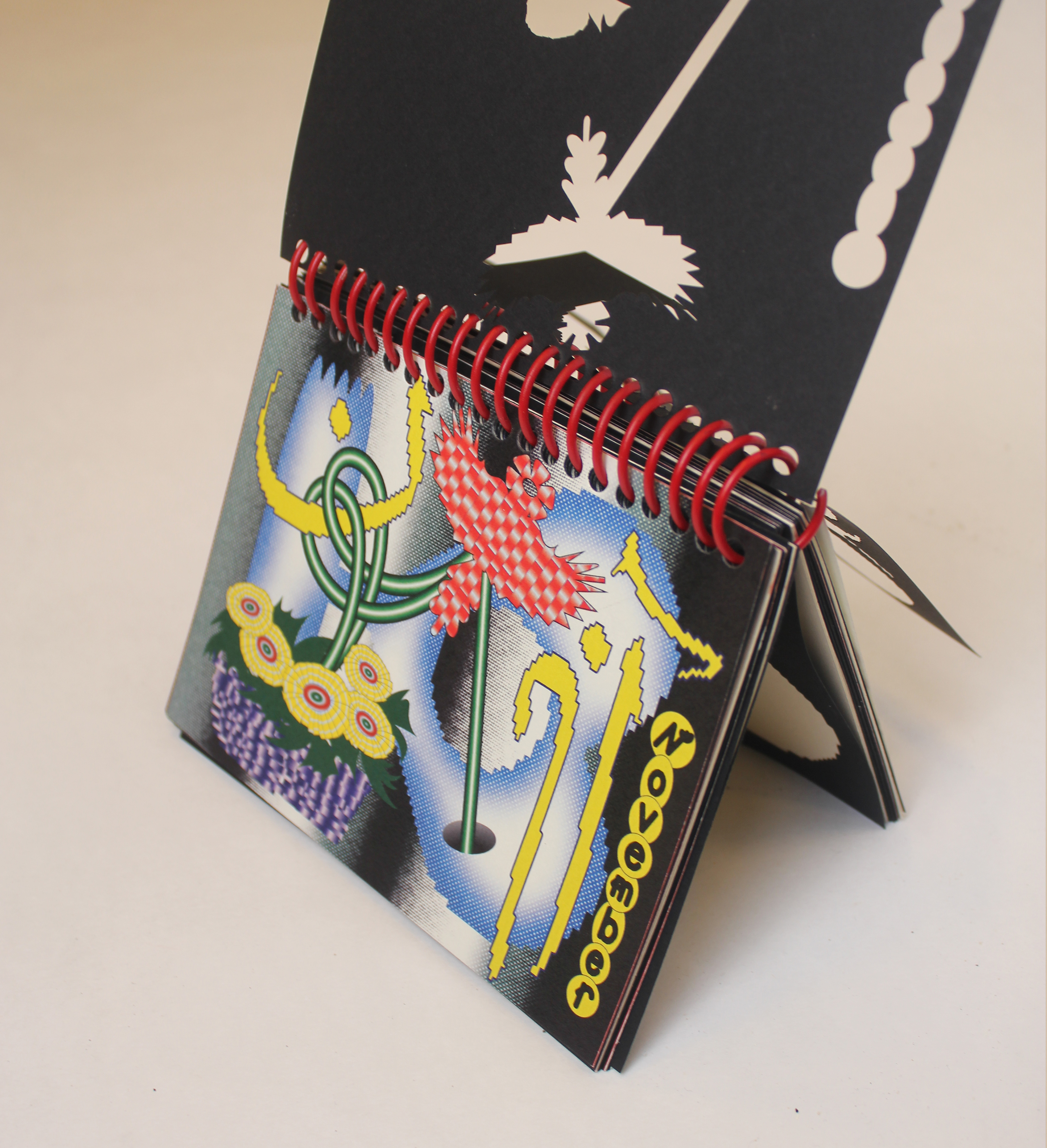
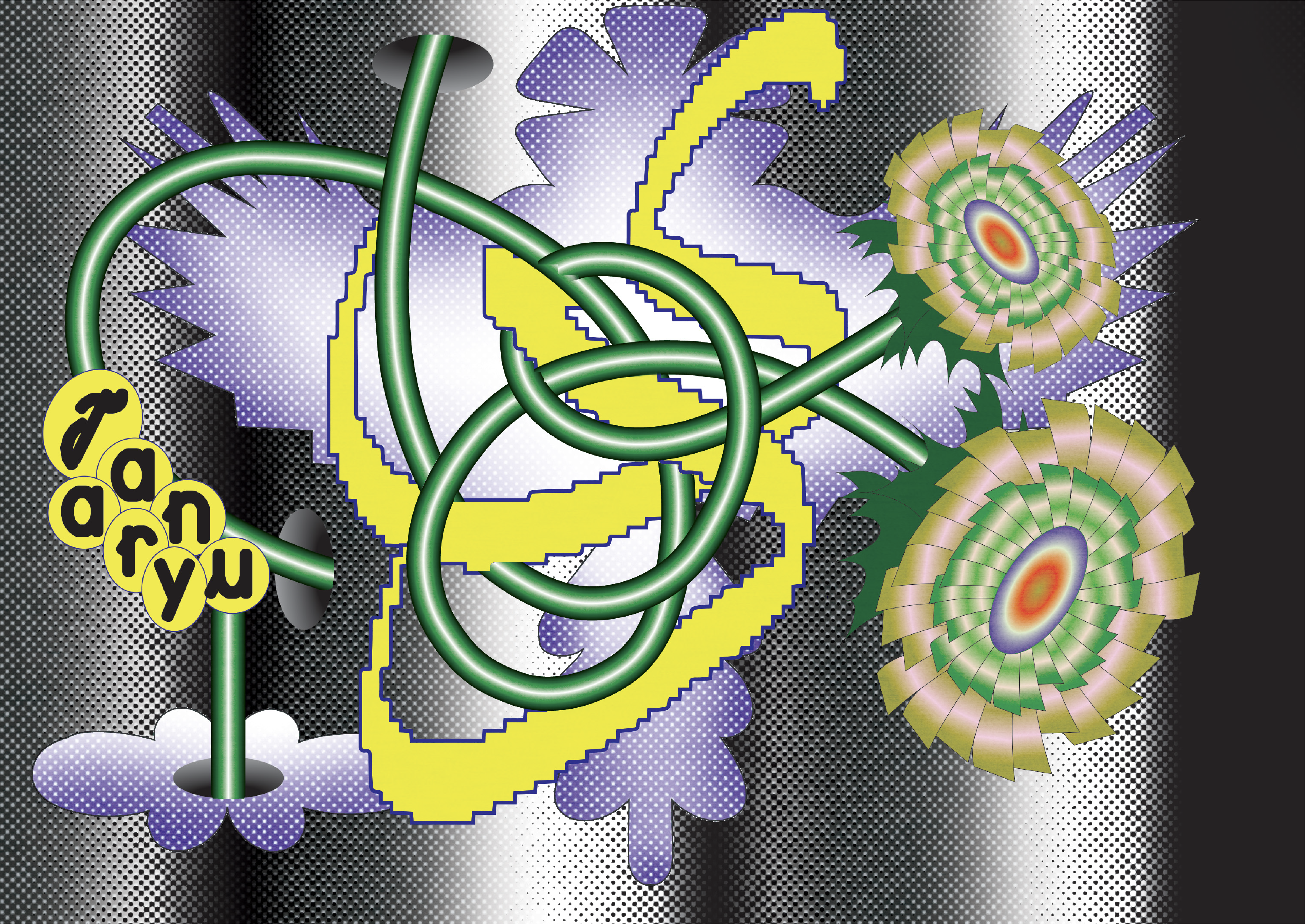
Calender 2026
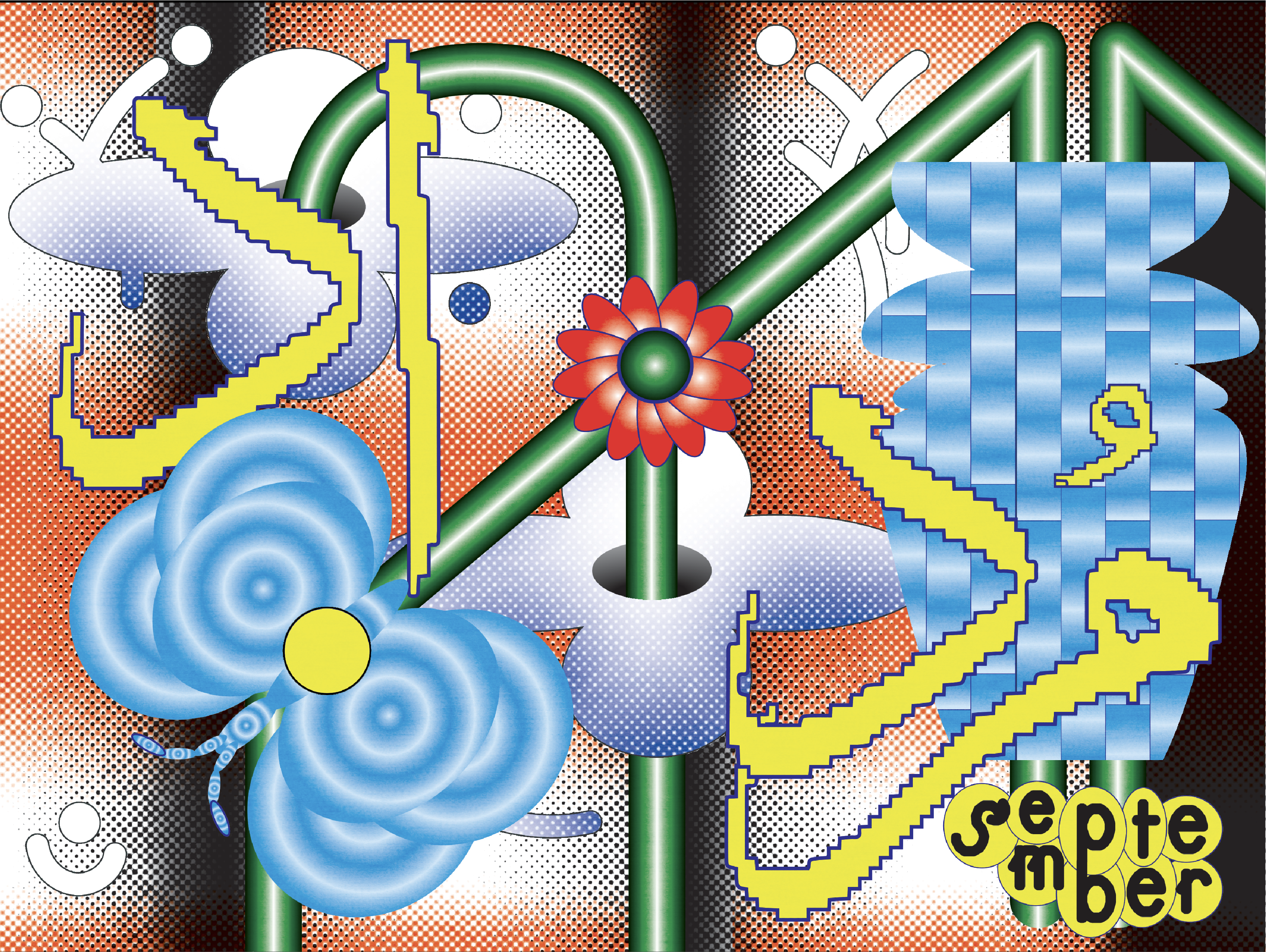
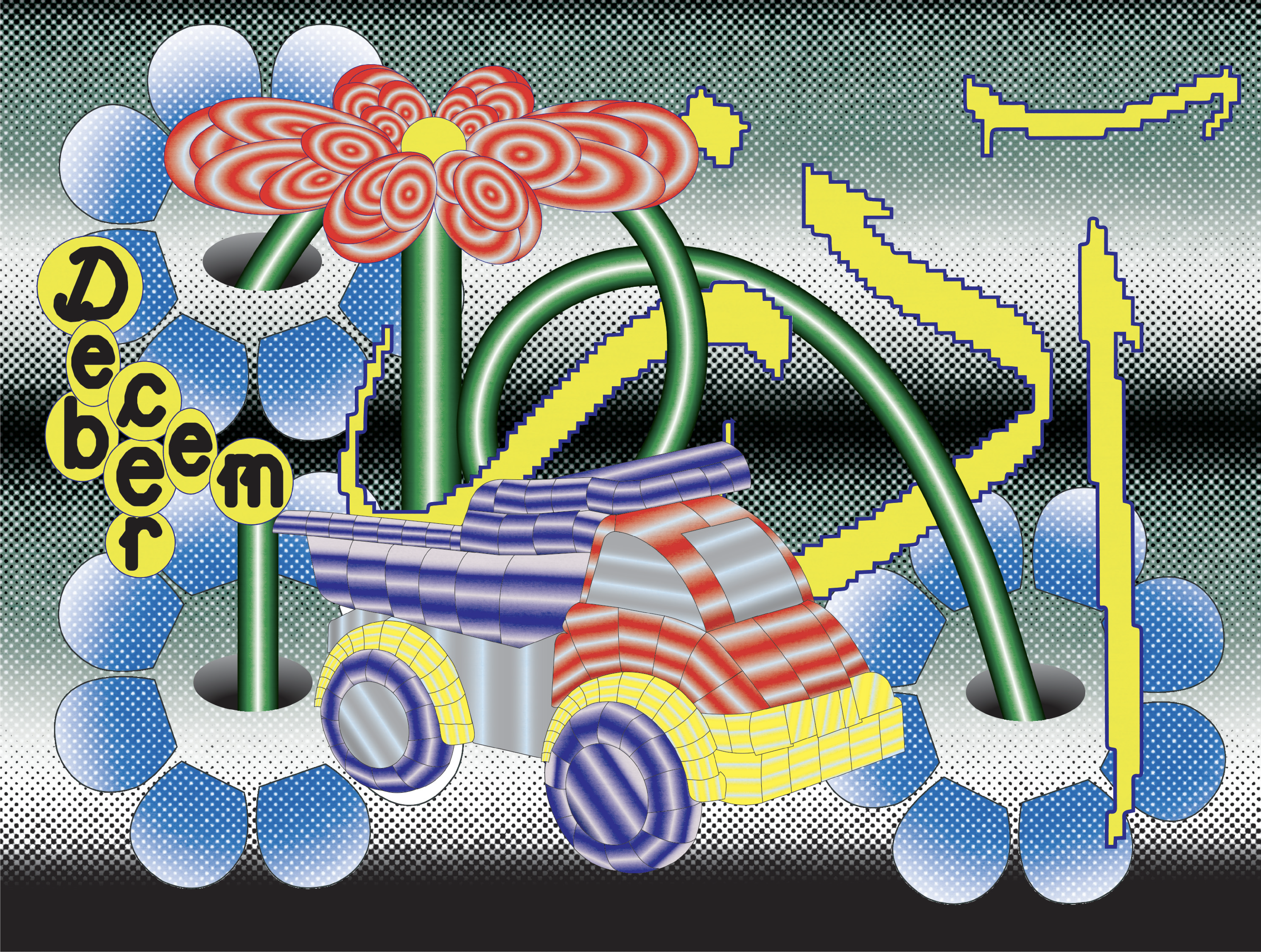
In this Calender, I explored Persian typography and illustration in a playful and experimental way. The challenge was to create a new image every month, each one with its own character, but still part of a larger set. After finishing each illustration, I would step back and think about how it fits into a collection of twelve. Together, they form a visual rhythm that unfolds throughout the year, with cut-out shapes and colors interacting across the pages.
Scroll for more
Coding
Digital publication
Editorial Design
Hybrid publication
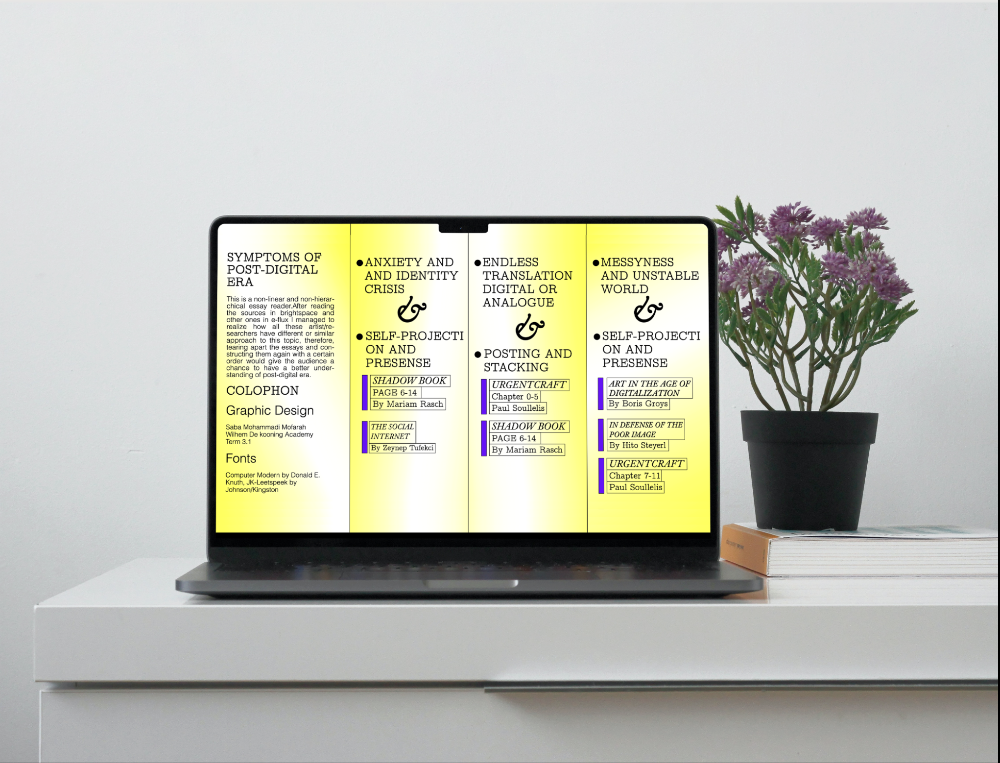
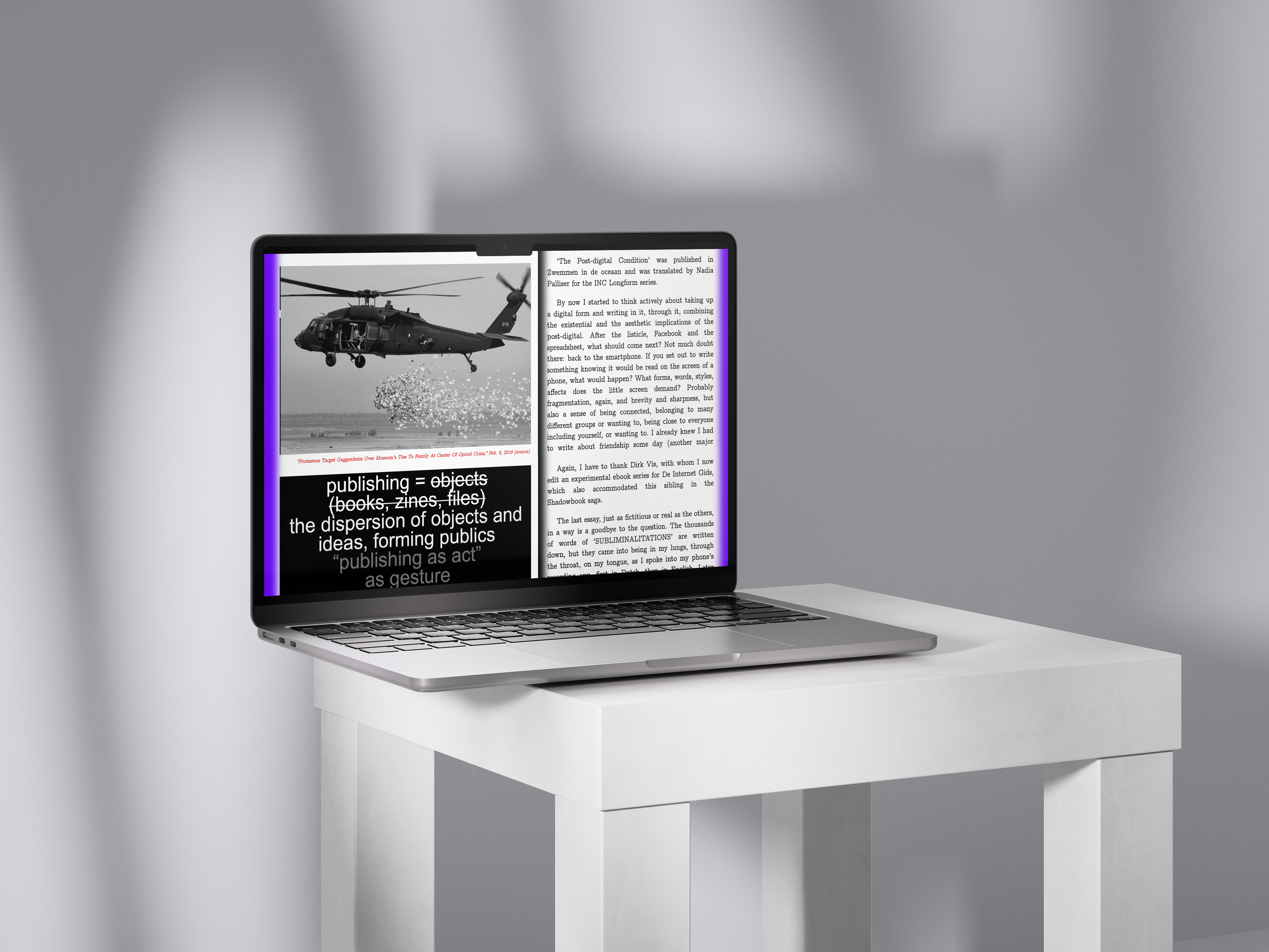
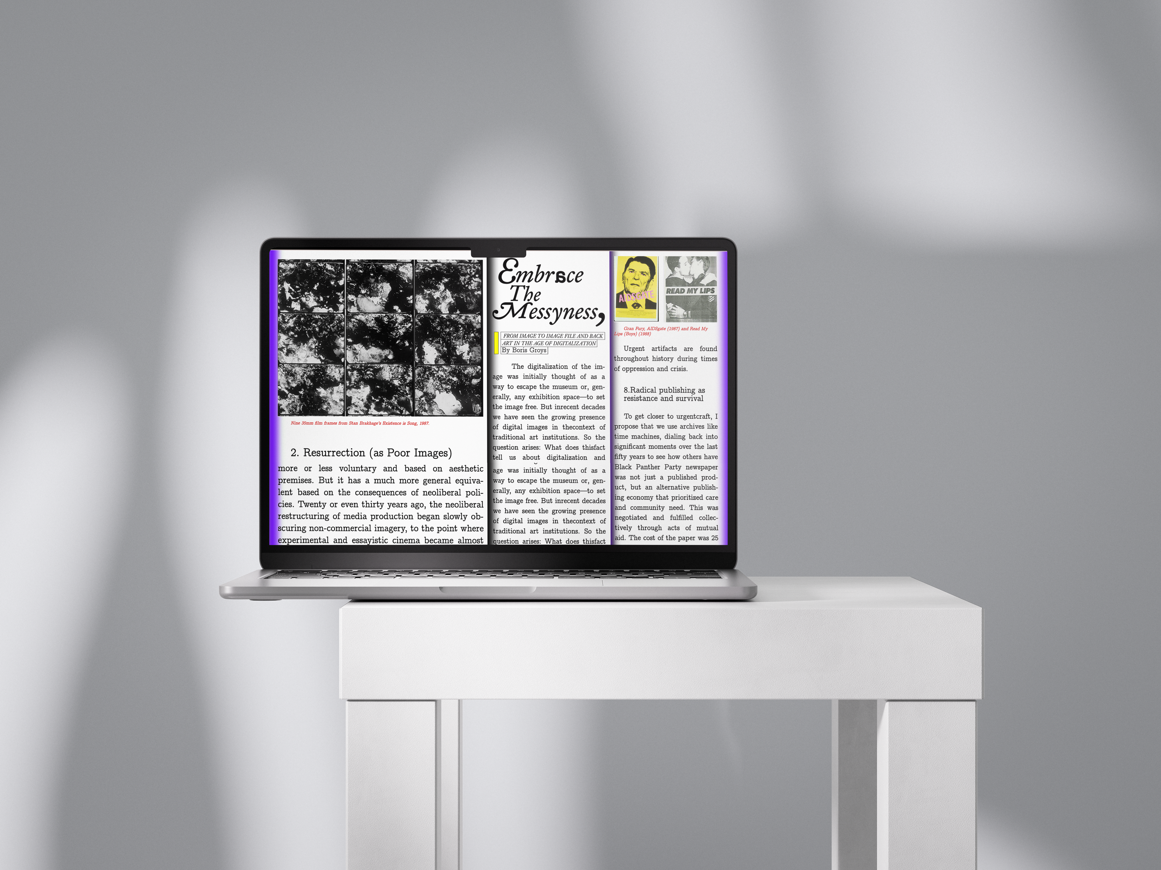
My final design evolved from mapping and visualising post-digital symptoms described in the shadowbook along with other essays. I wanted to explore how the concept of the post-digital, the fusion between analogue and digital, could be expressed through a typographic blend within a non-linear and non-hierarchical essay reader. After reading the sources in brightspace and other ones in e-flux I managed to realize how all these artist/researchers have different or similar approach to this topic, therefore, tearing apart the essays and constructing them again with a certain order would give the audience a chance to have a better understanding of post-digital era.
Scroll X for proccess
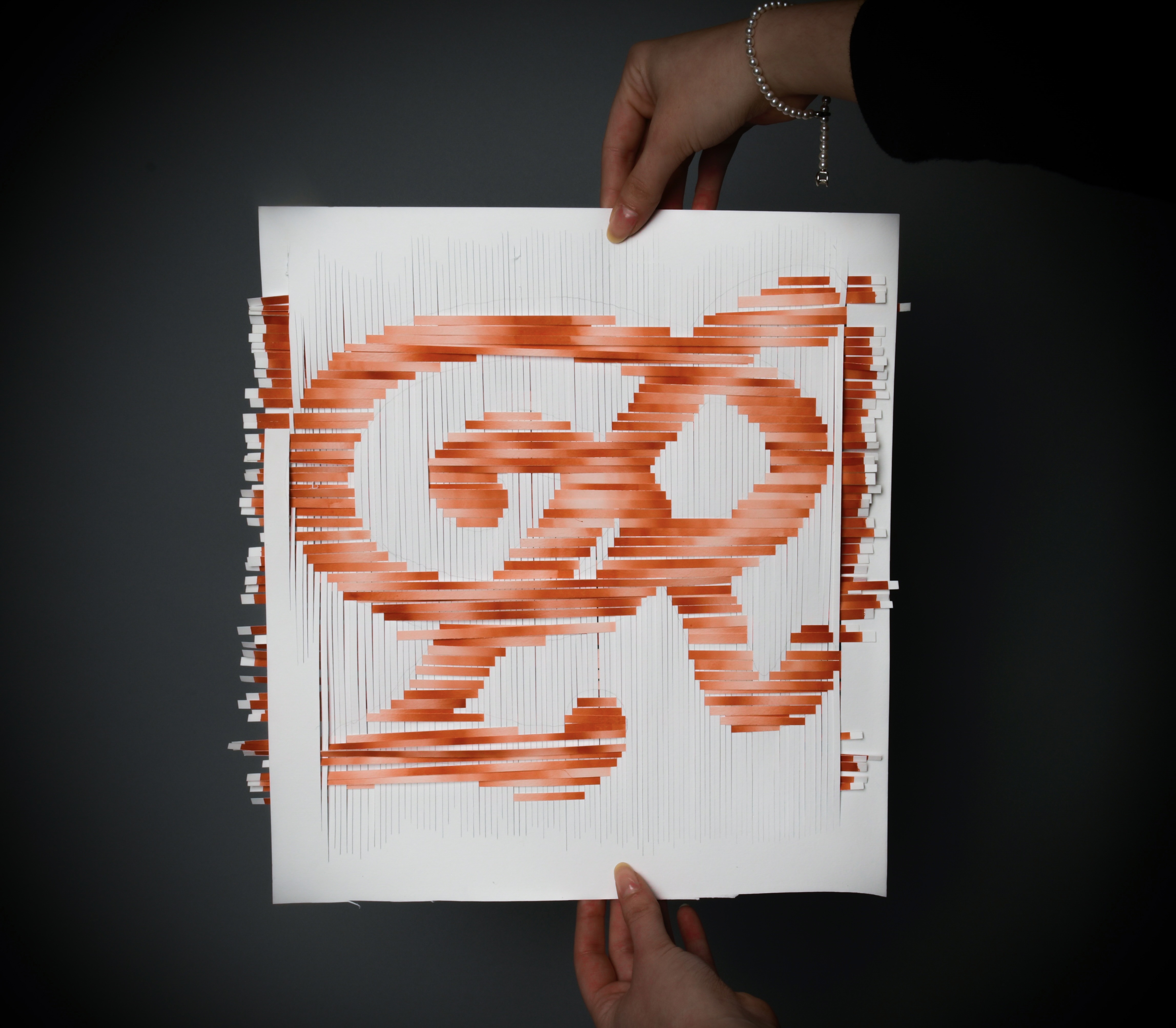
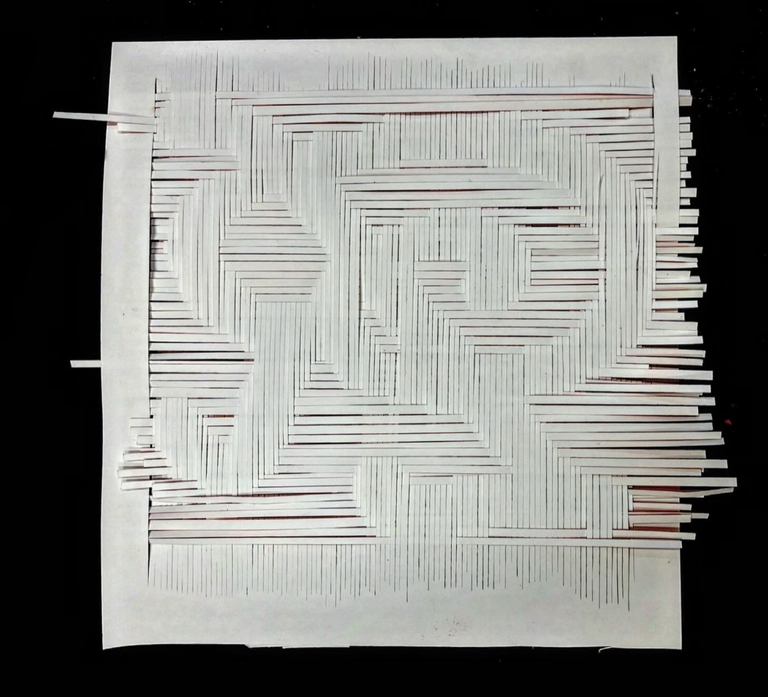
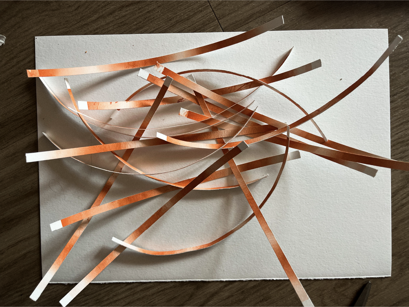
Saffron
Weaving
Airbrush
Experimental
Materials and Systems 2025
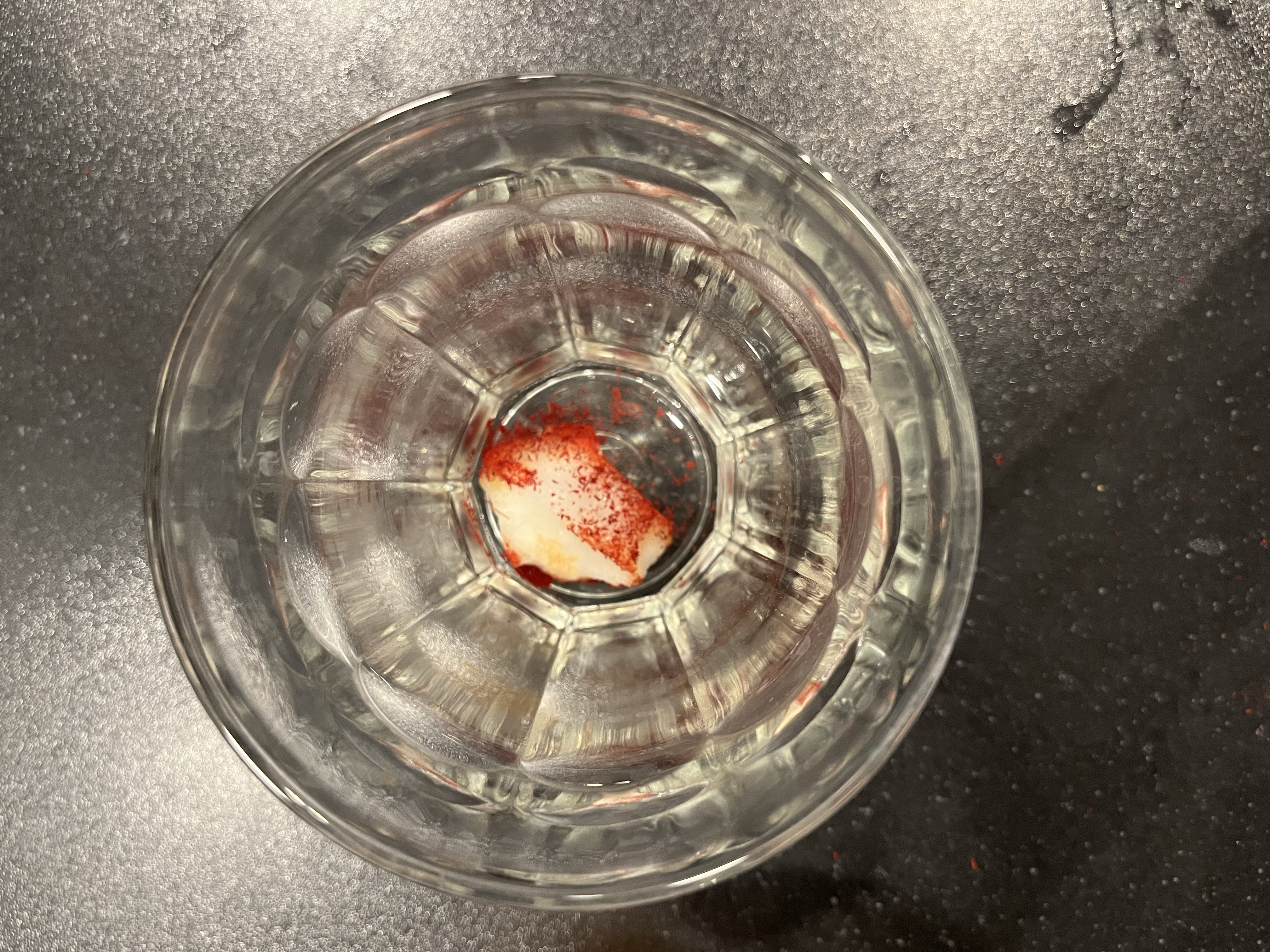
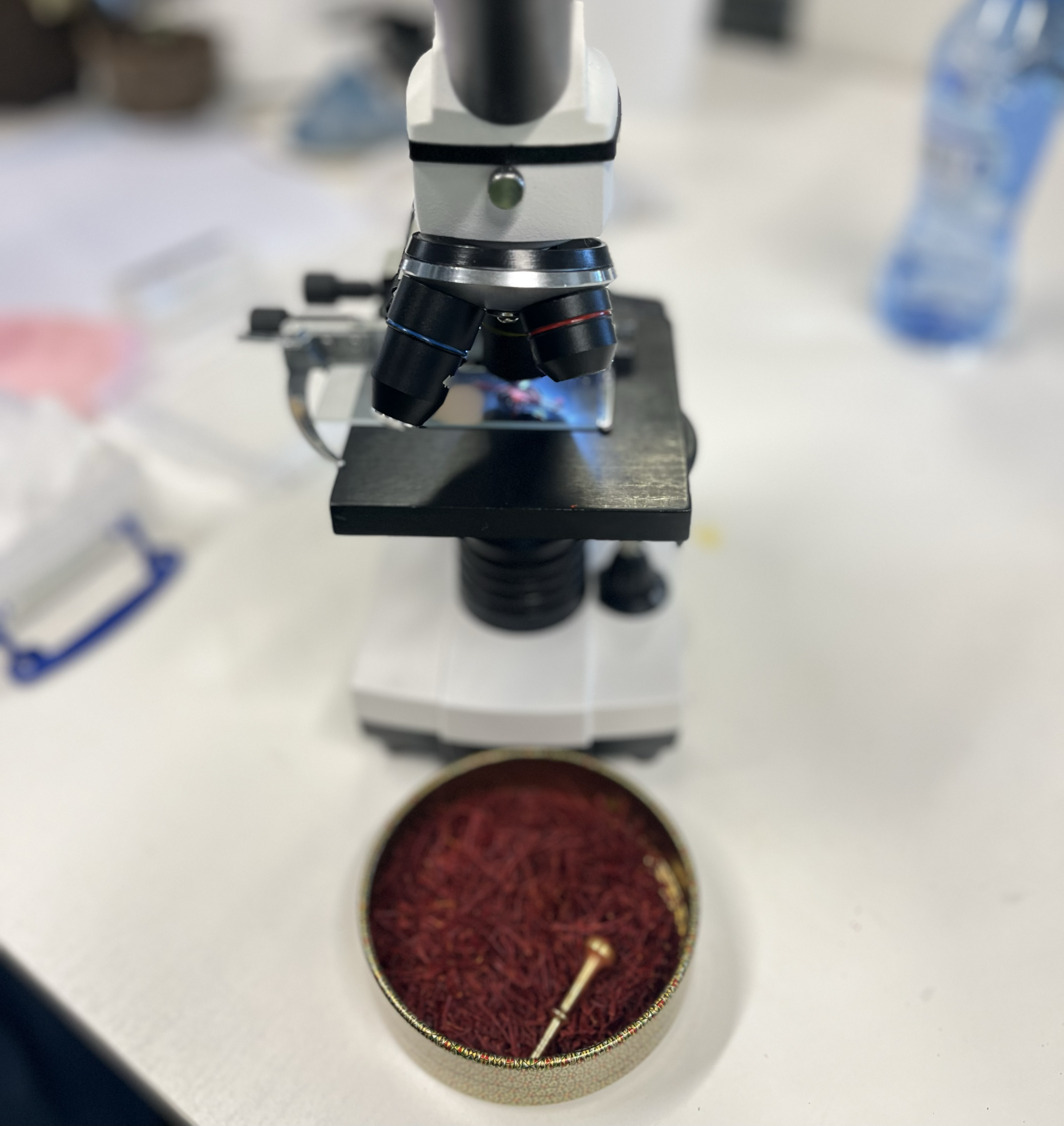
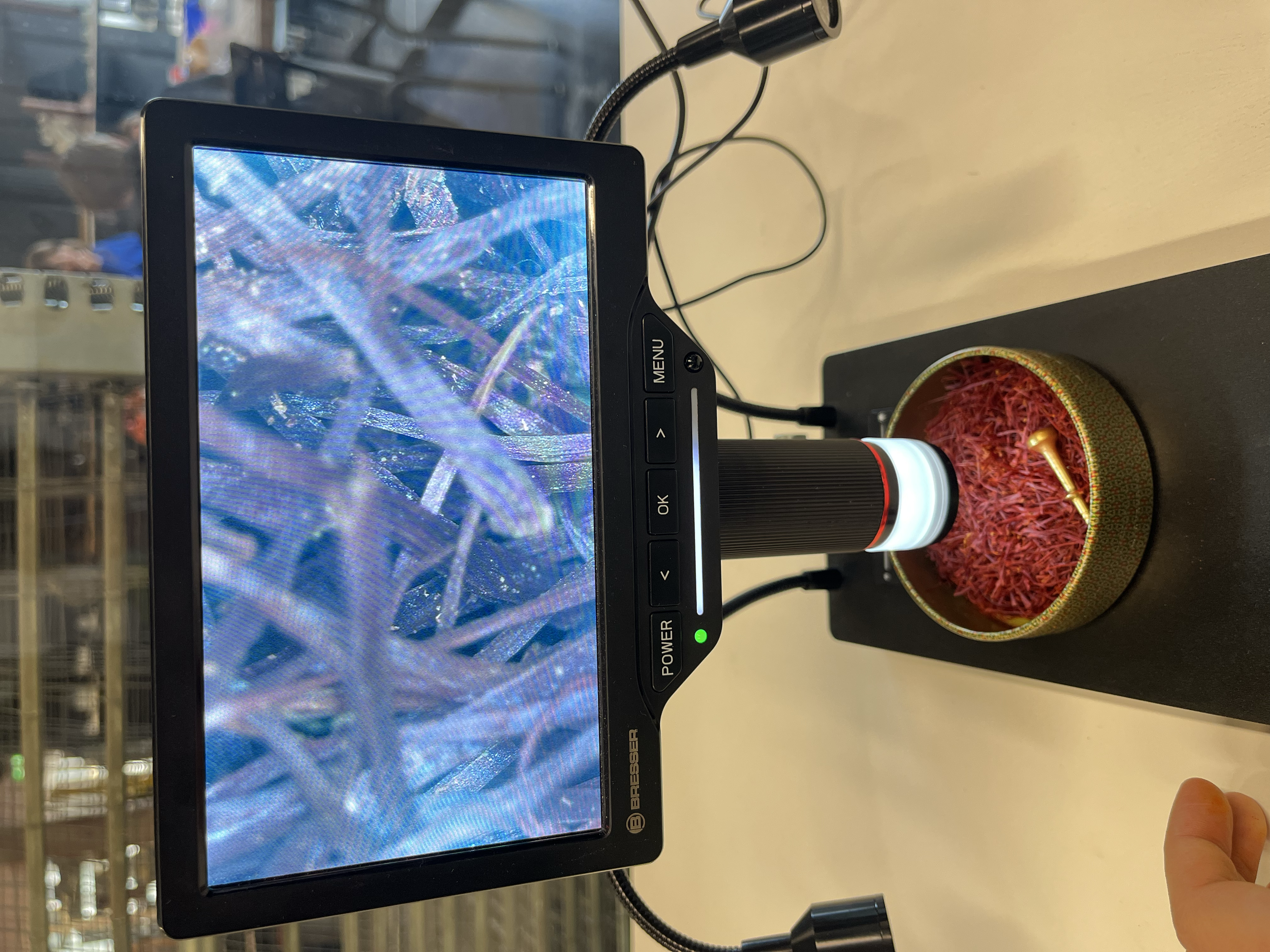
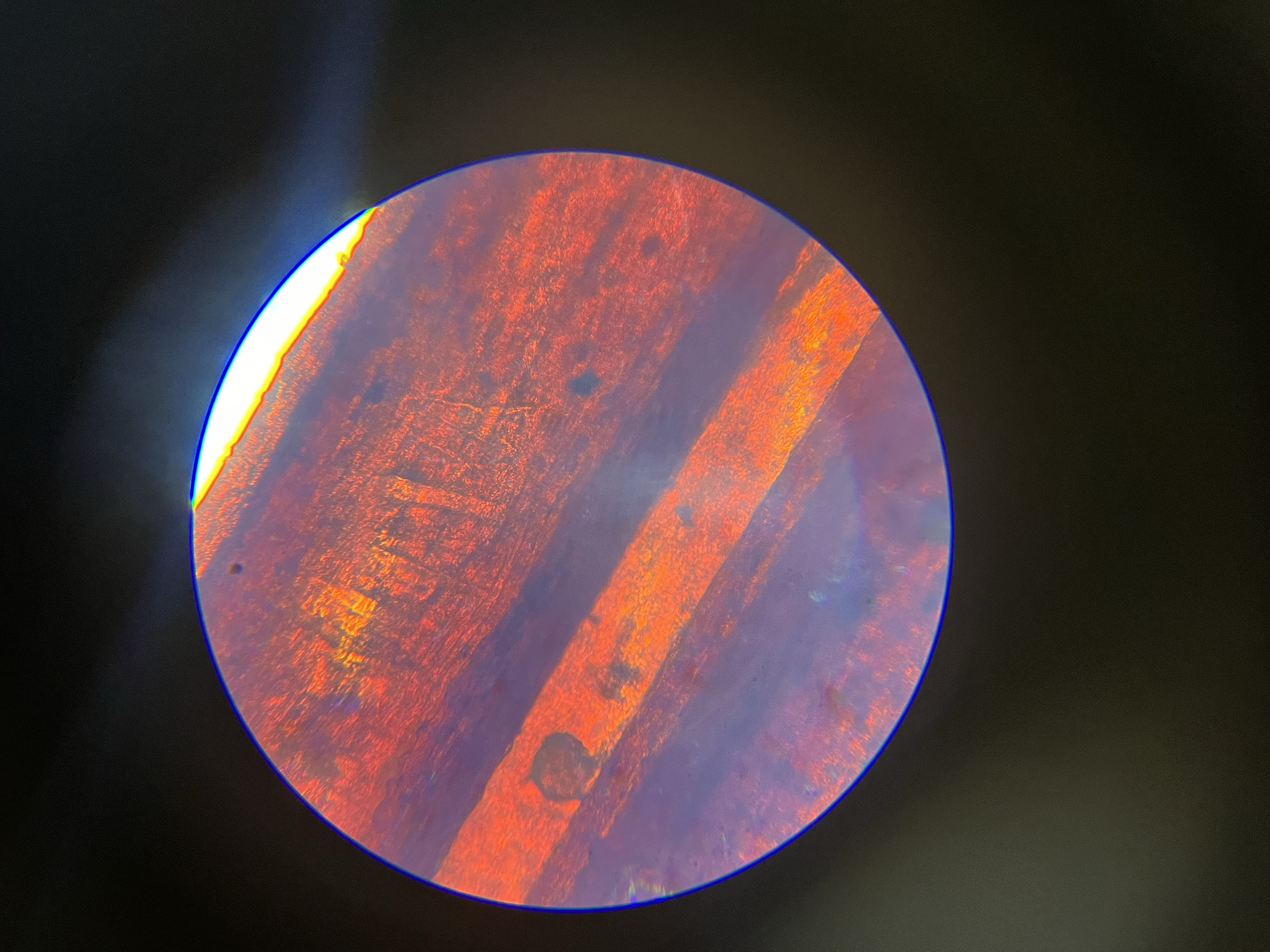
Creating a visible language through the unconventional use of saffron as a material. Through this project, the goal is to redefine how everyday materials can be used in visual design by elevating a simple, edible substance into a tool for creative expression. Using saffron, I created a natural dye and experimented with it through airbrush techniques, applying it onto paper to produce a series of colored surfaces in different shades of golden yellow.
Why is the letter weaved with pieces of paper? The econommical value of this materials stems from the heavy labor it requires for it to be collected. Instead of coloring the letter right away, I chose to weave it with saffron-colored stripes to metaphorically represent the time, repetition, and effort behind saffron’s harvestation.
Typography
Application Document
Poster
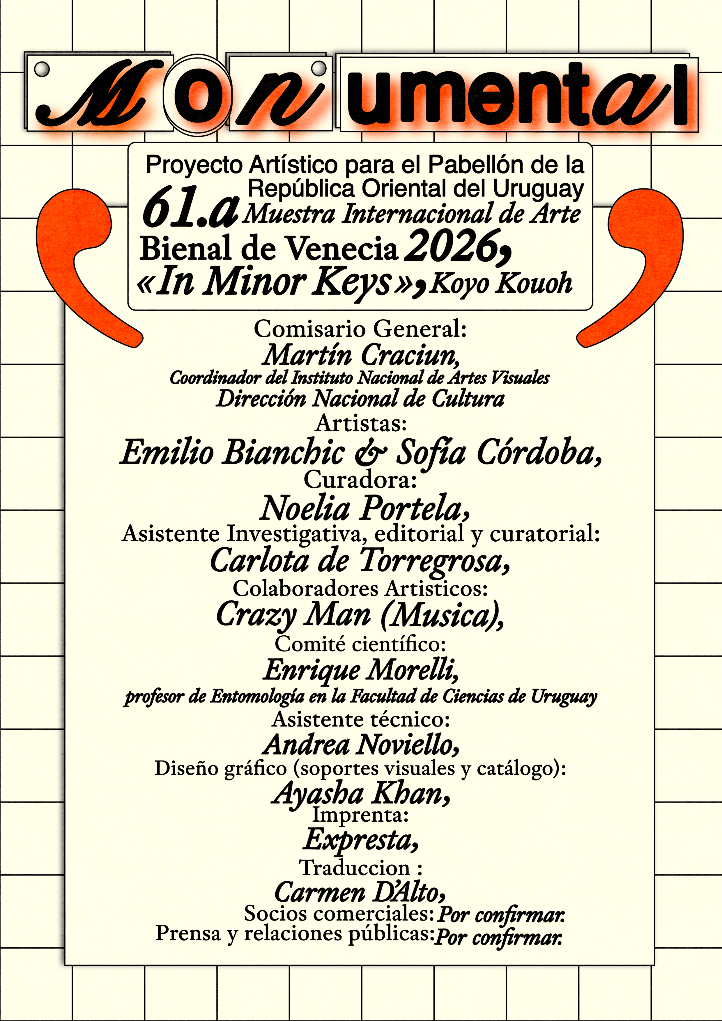
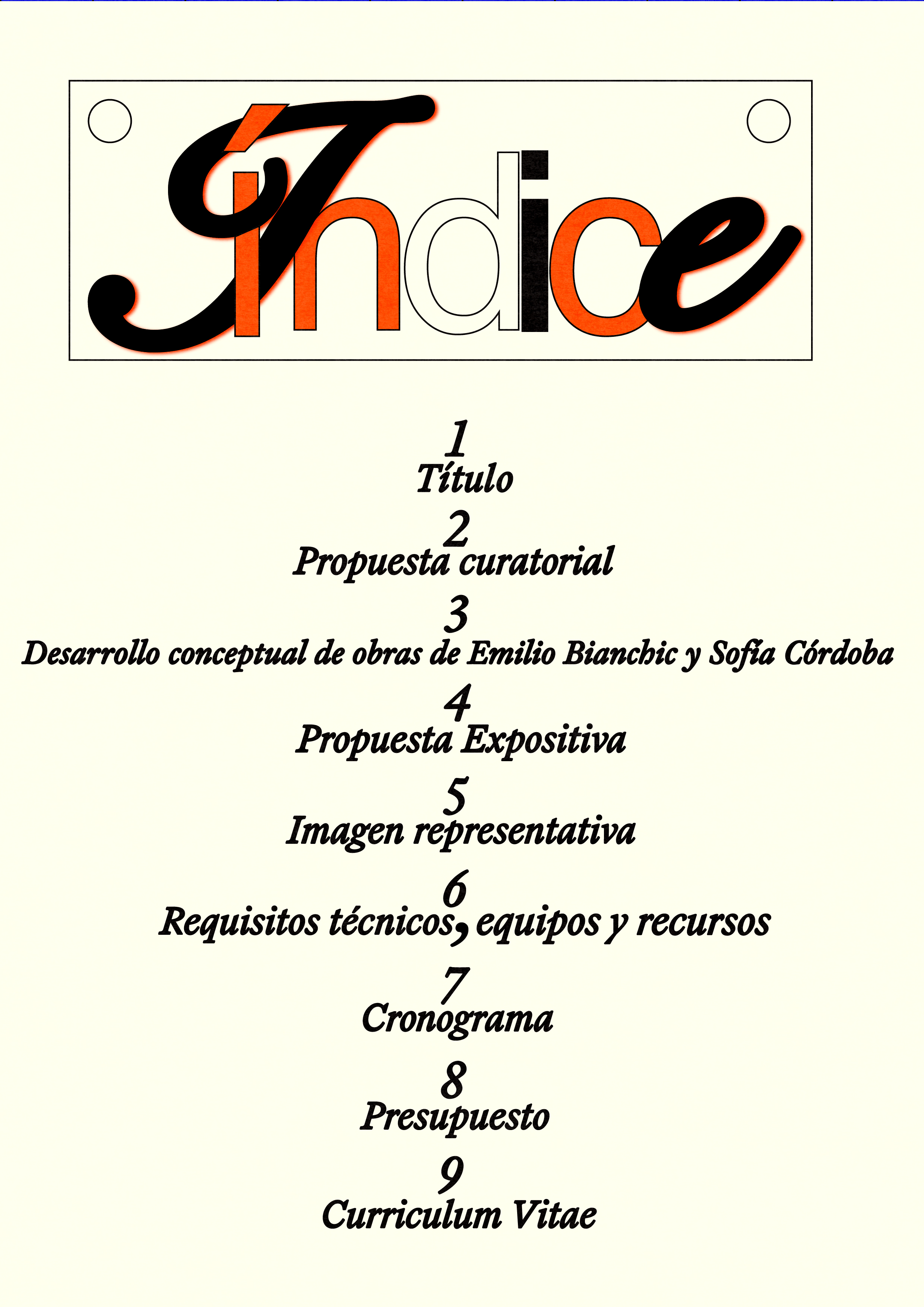
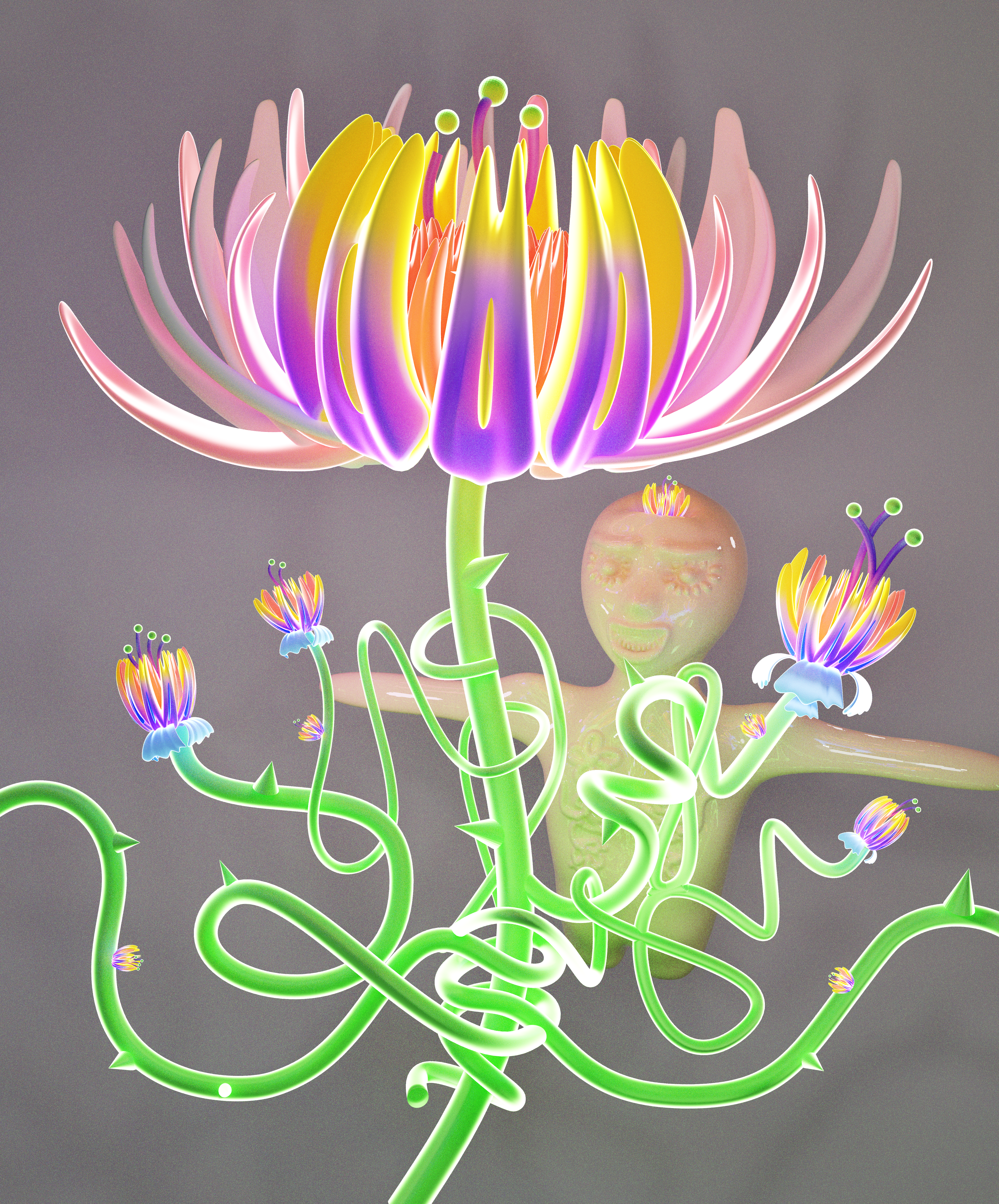
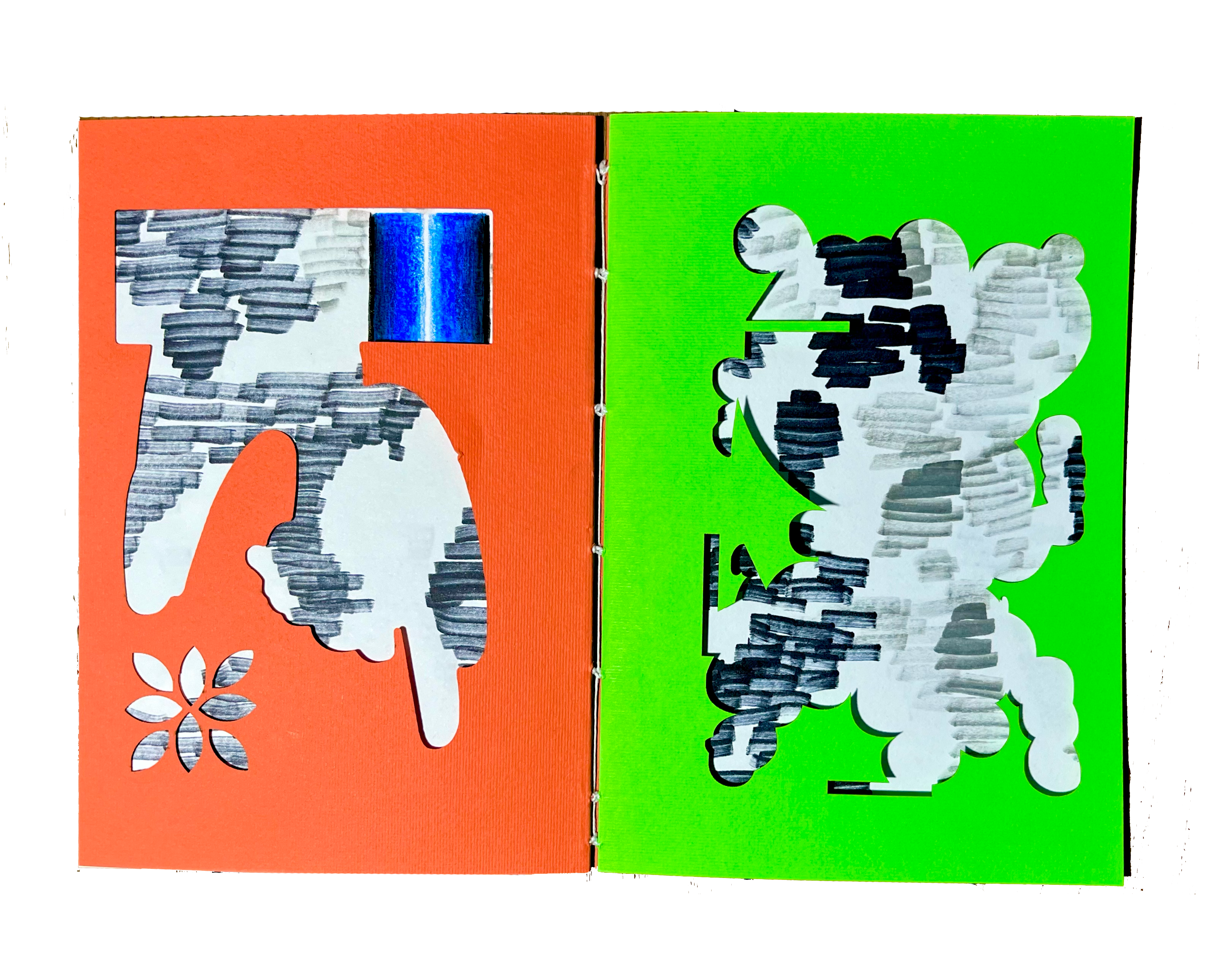
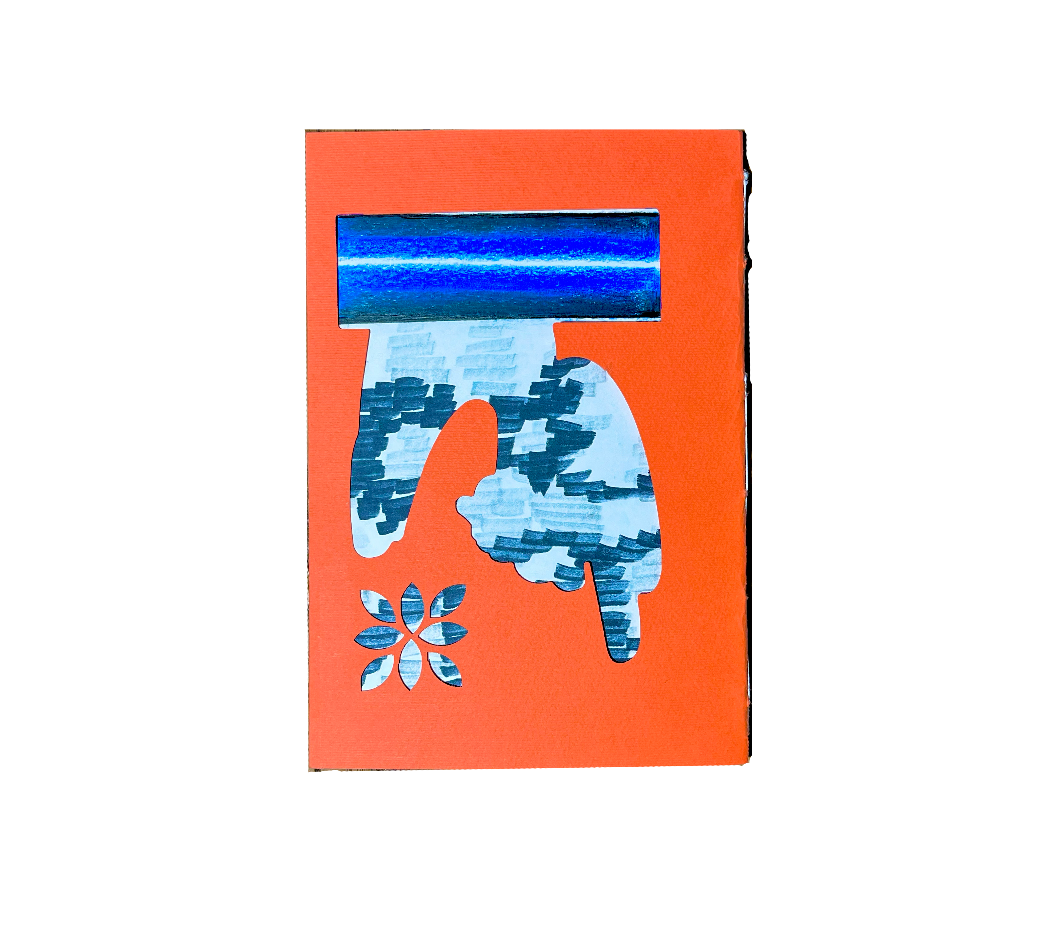
Venice Bienale 2026
Following the invitation from curator Noelia Portela to design the graphic identity of her application for the Uruguayan Pavilion at the Venice Biennale, I created a visual universe that reflects and amplifies the curatorial proposal.
I developed a bold and vibrant iconography: the blue chosen for the pavilion’s walls interacts with orange tones inspired by the trunks of Uruguay’s palm trees, referenced in the artworks of Sofía Córdoba. The result is a playful and expressive visual language, in direct dialogue with the practice of artist Emilio Blanchic.
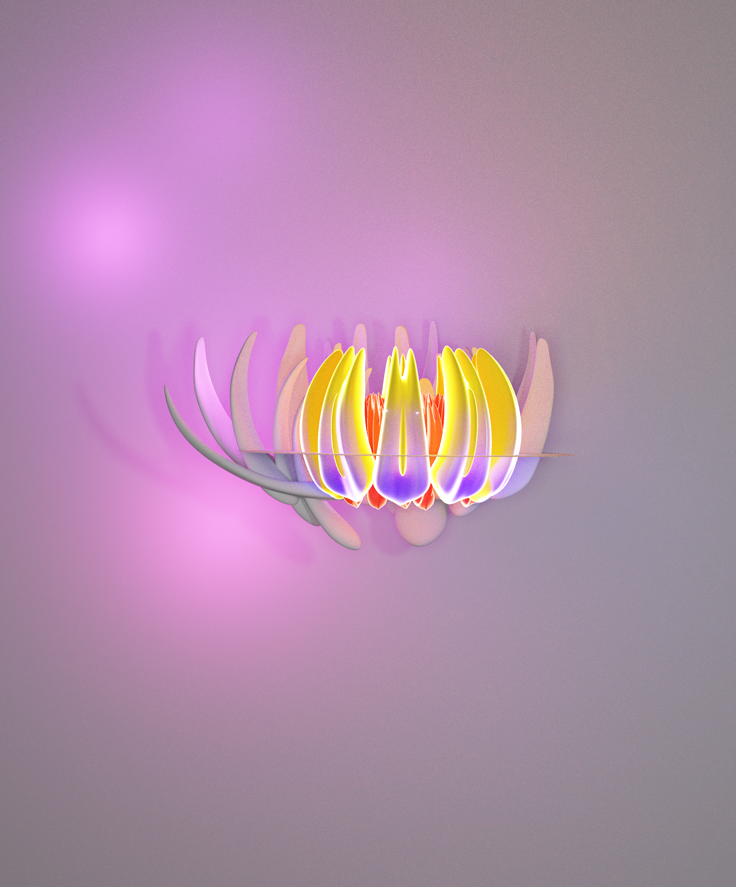
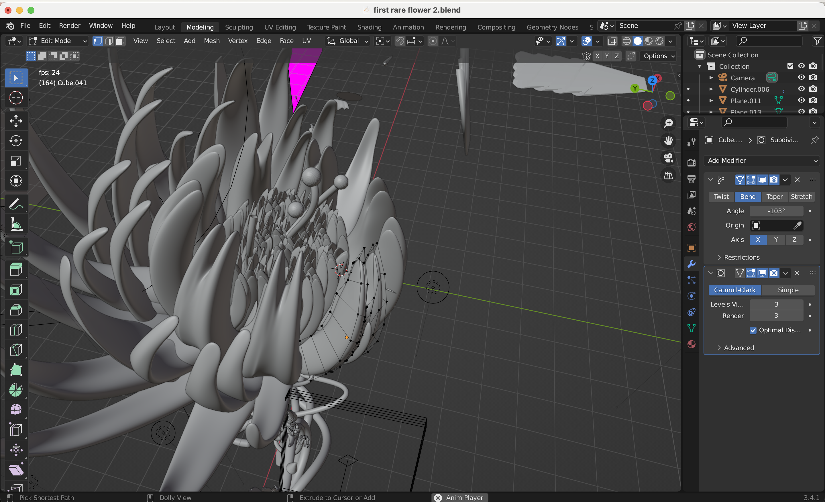
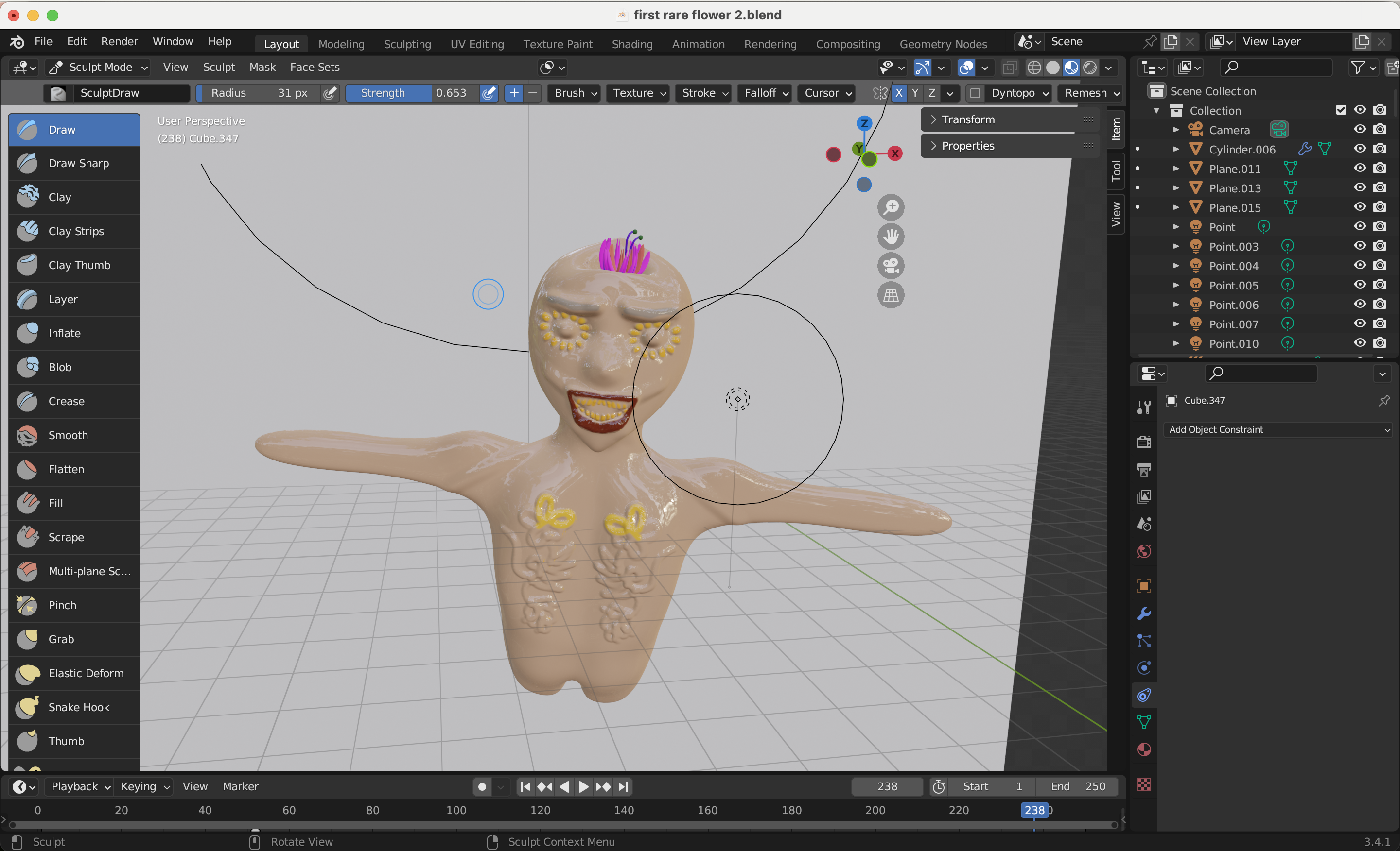
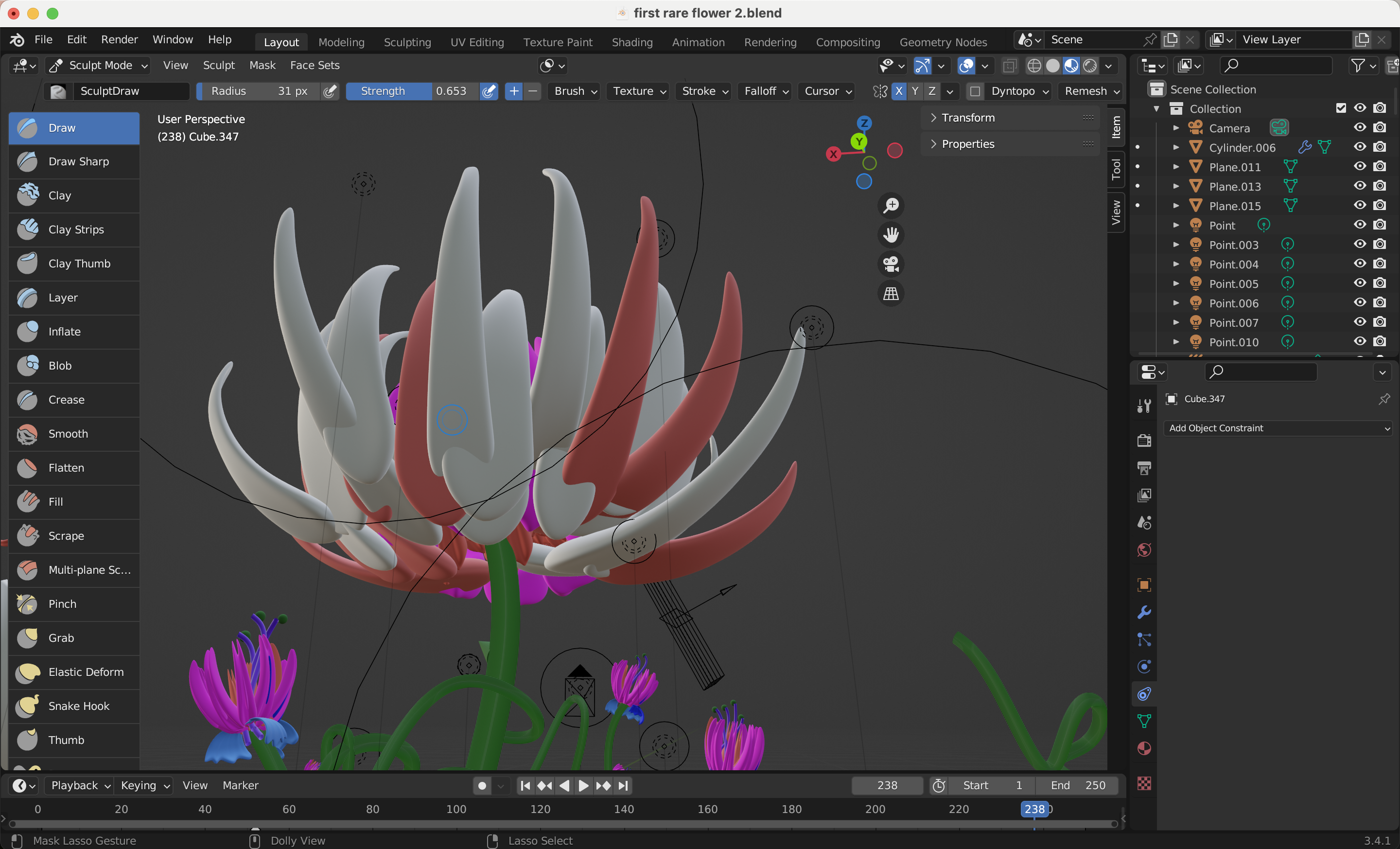
Blender
3D
Made in 2022
Blender practice
This is me trying to discover a whole new software before applying to
Willem de Kooning Academy. First, I started with making a donut with the famous video in youtube.
After, I played around in the software and tried to combine my own aesthetics and vision
with the technical knowledge I achieved.
publication
contemporary
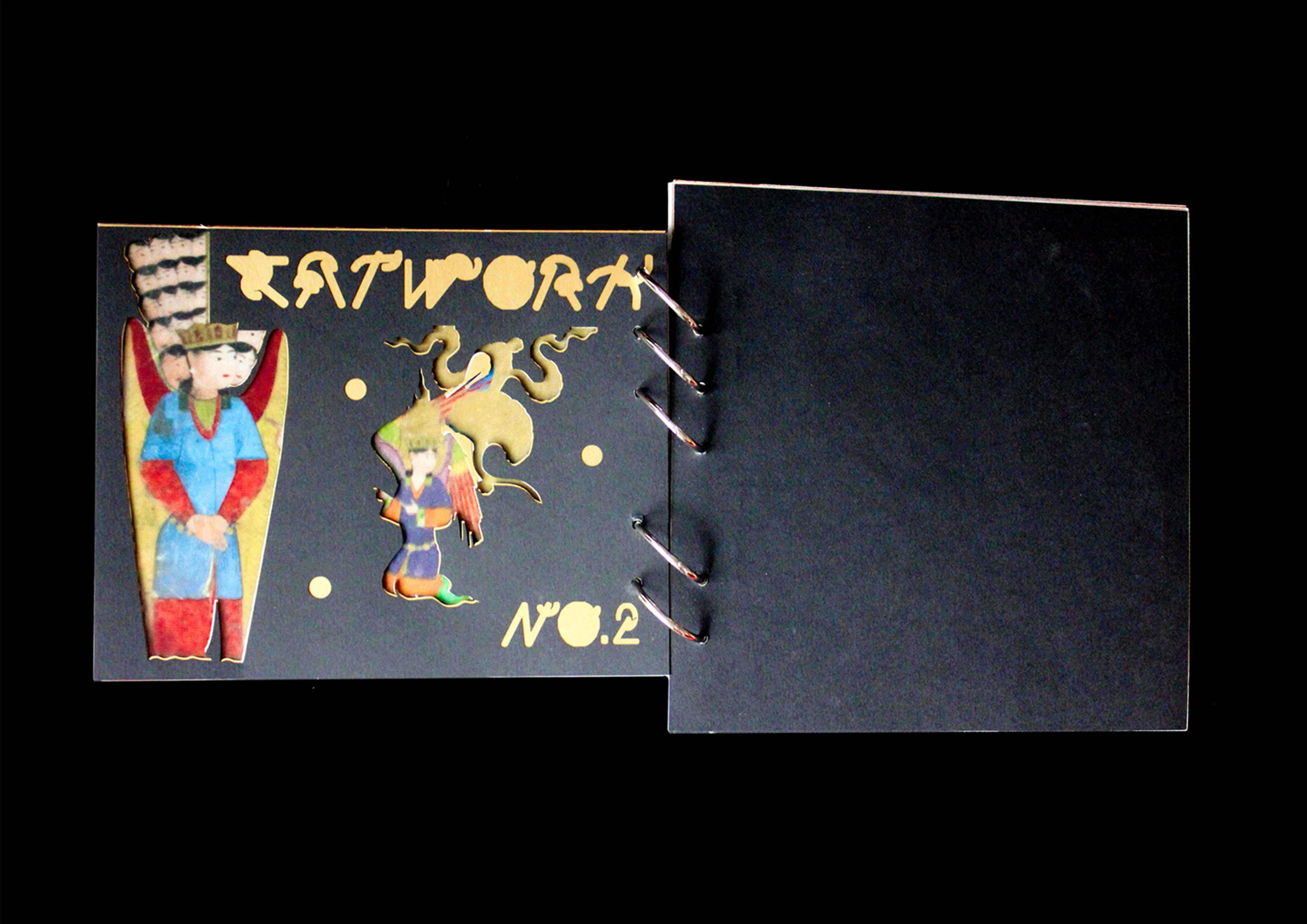
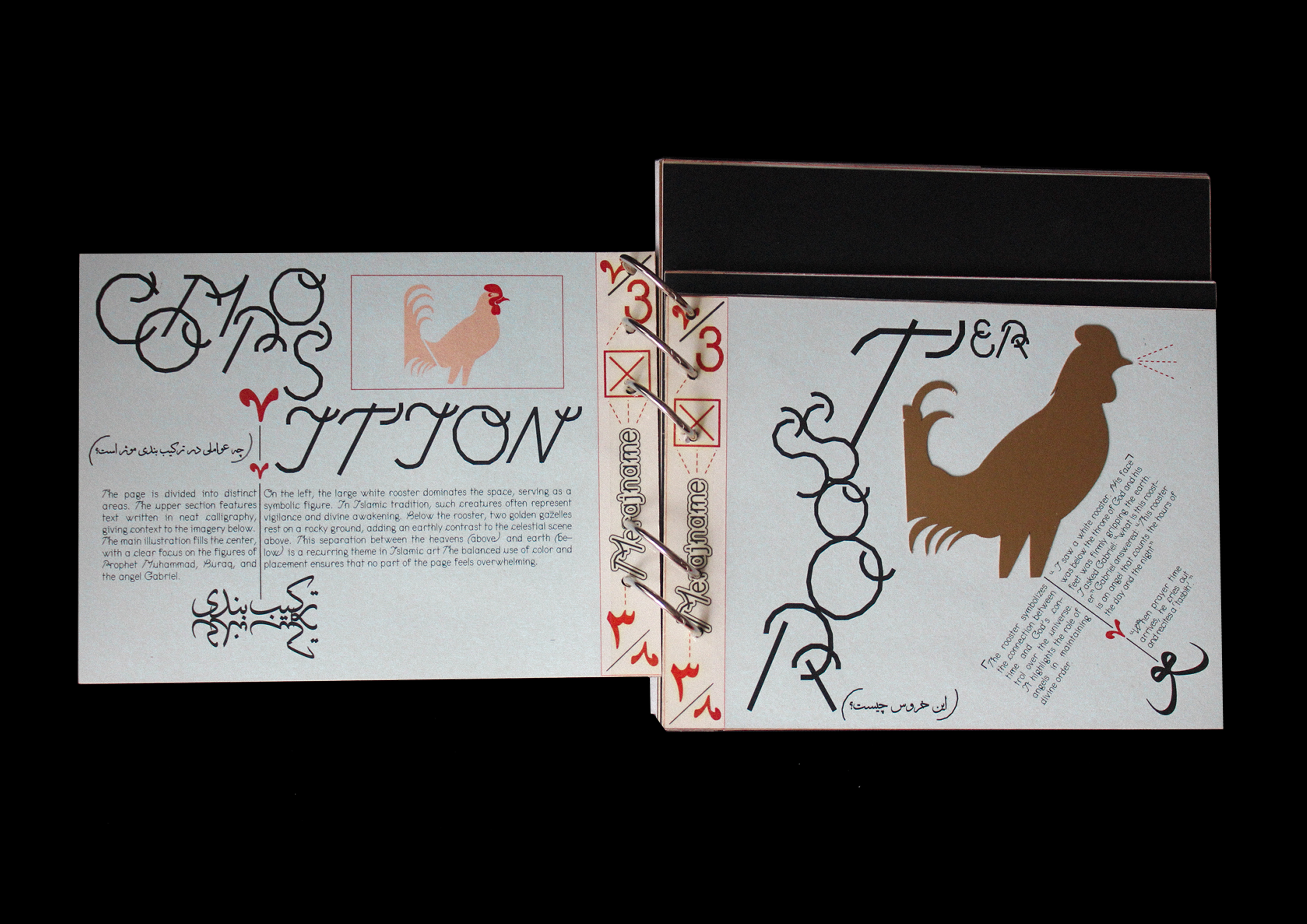
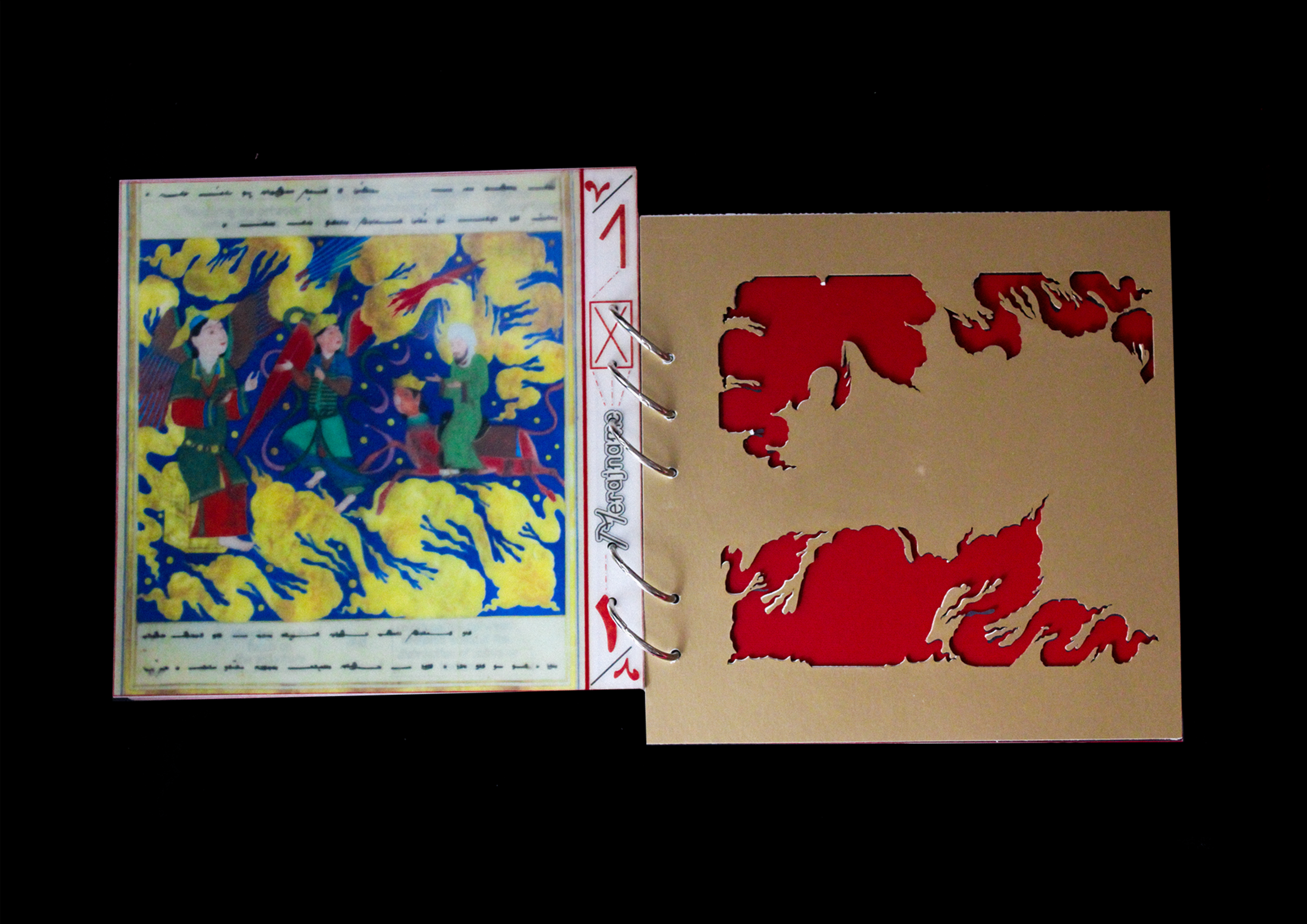
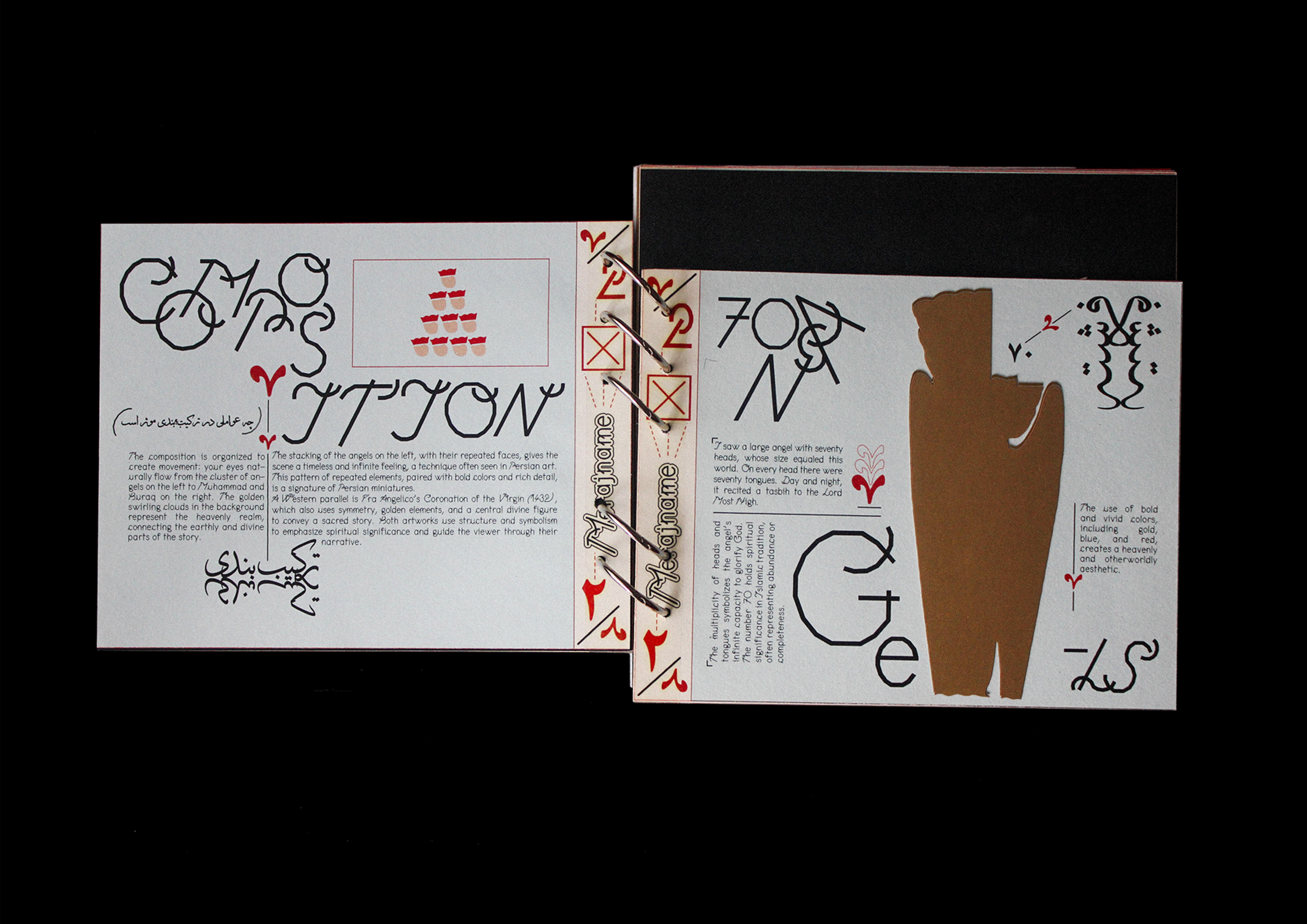
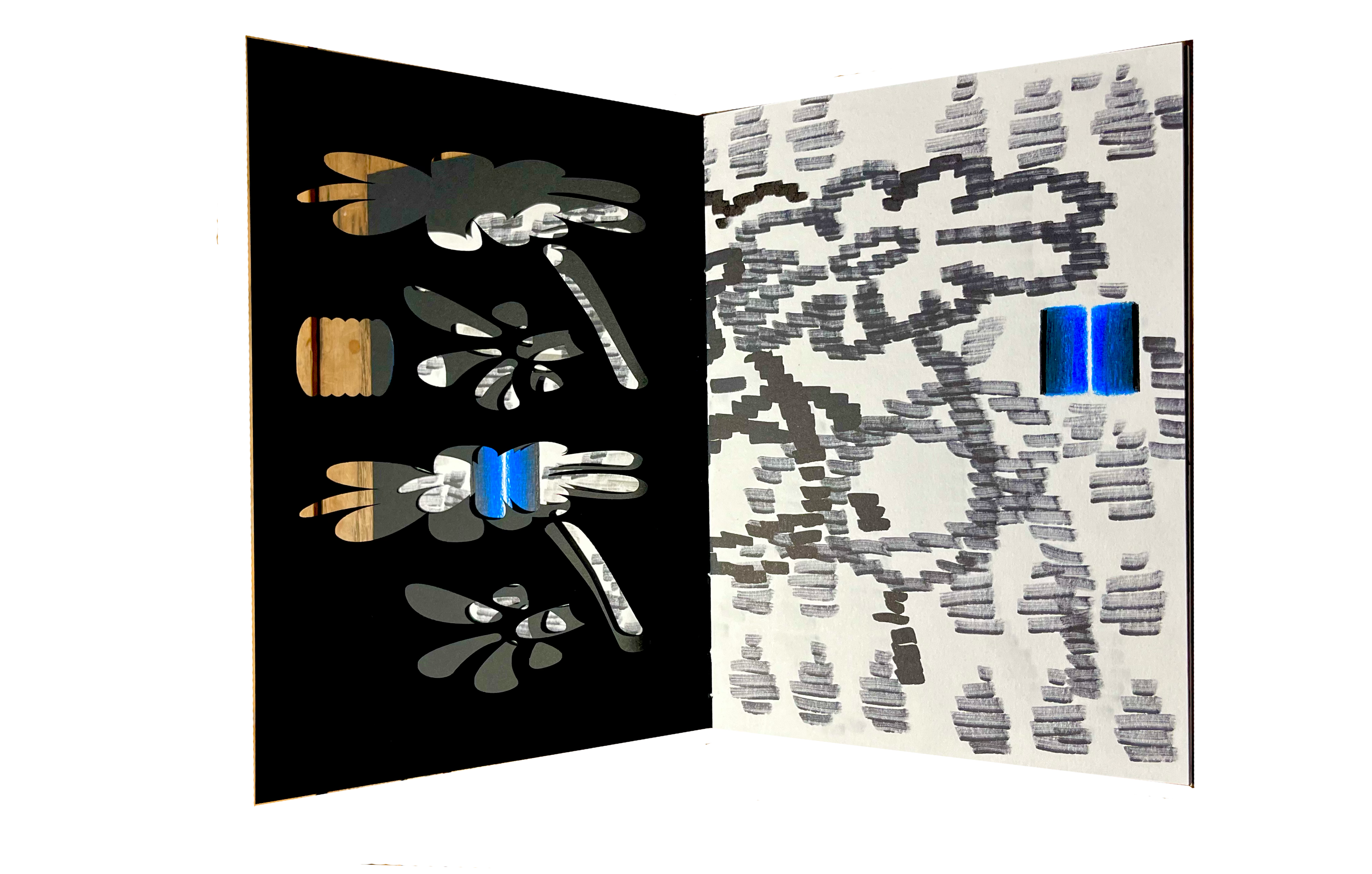
Persian miniture
cut-outs
Editorial Design
Between Archive and imagination 2024
In this project, I wanted to shift the perspective. I used my voice as a visual communicator to explore how artists and designers today can engage with and be inspired by ancient artworks. The book I designed focuses on a Persian miniature manuscript painted in 13th-century Iran. Rather than simply reproducing the work or explaining it academically, I approached it as a conversation across time, one visual language responding to another.
By combining different printing techniques, materials, and formats, I aimed to make the book feel contemporary and unconventional a living object rather than a historical document.
publication
artist's Book
cut-outs
Artist's Book 2023
A series of small publications I did based on my exhibition (From deja to vous) in The Hague, They are all currently on display in Kiosk Rotterdam.
poster
typography
Illustration
Etude and Final
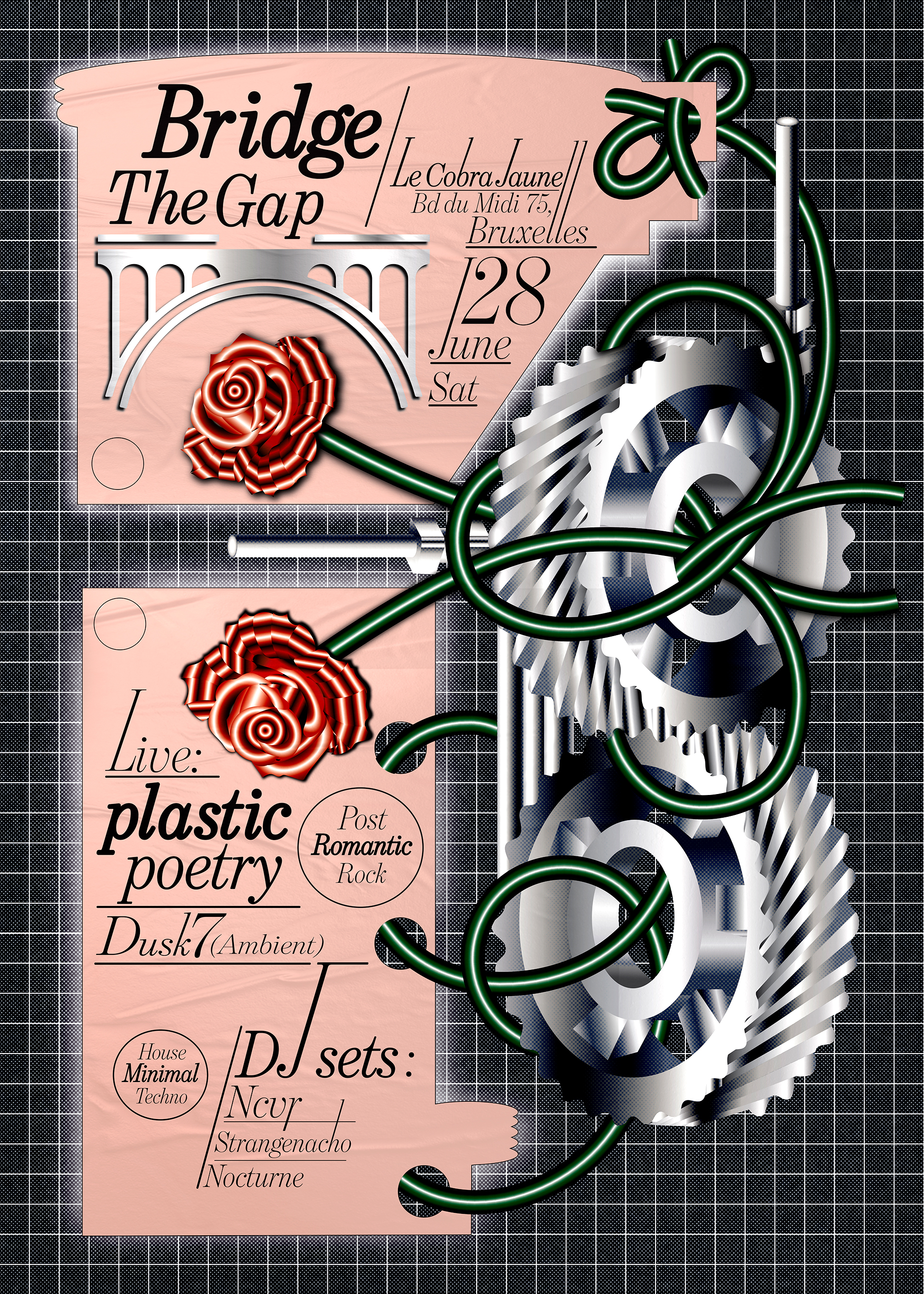
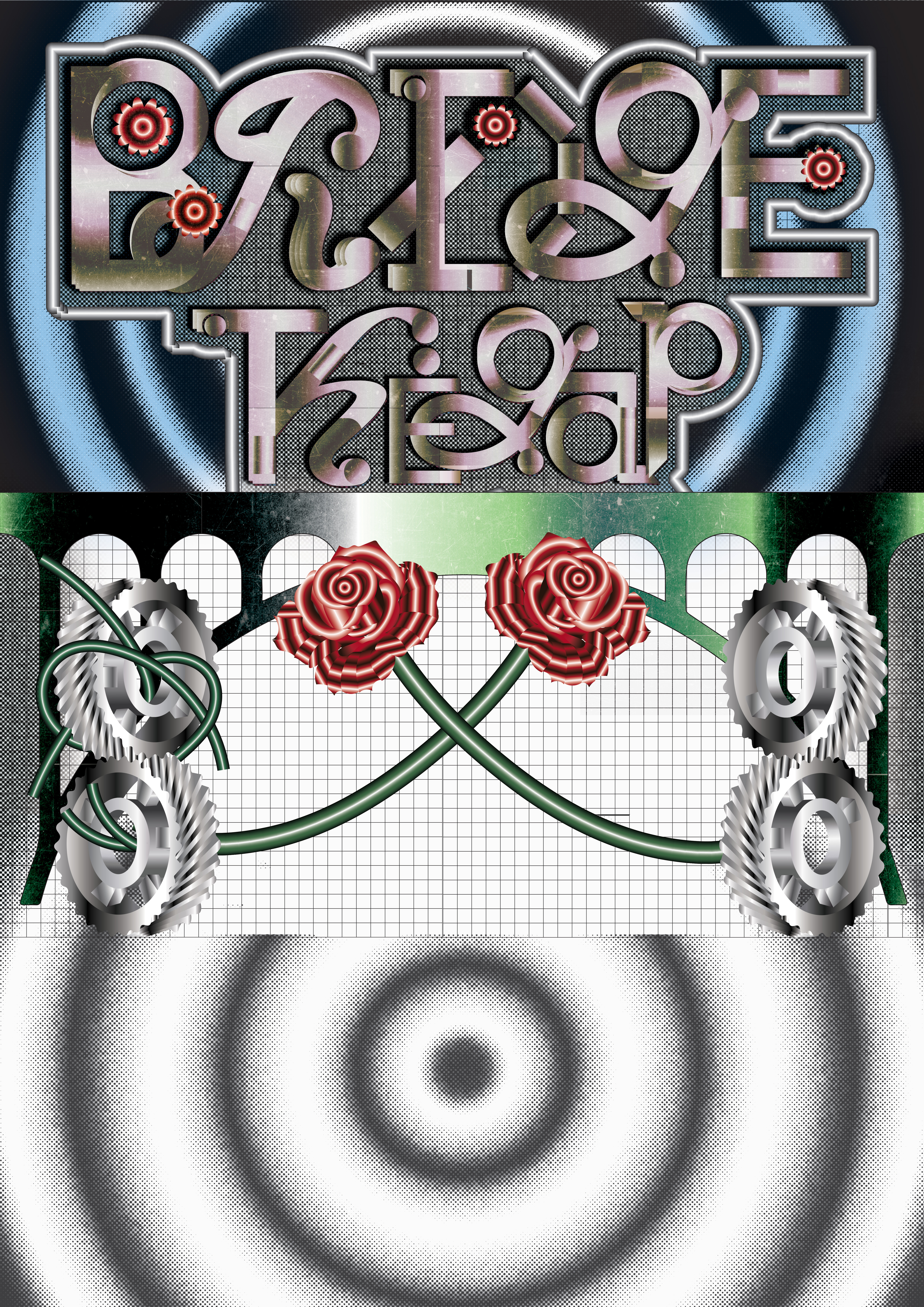
Bridge the gap 2025
Plastic Poetry are an indie/alternative rock band based in Glasgow, Scotland. They describe themselves on social media as “Alternative Rock Band from Glasgow”.
Their music blends elements of indie rock and alternative textures; from their recorded tracks you’ll hear expressive vocals, guitar-driven melodies, and atmospheric touches as heard on their track Beneath the Disco Ball.
This is the poster I designed for their concert happening in brussels.
Poster
Typography
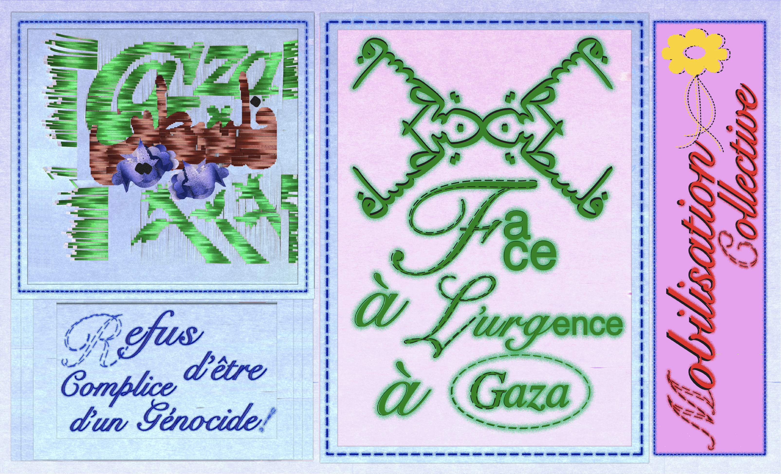
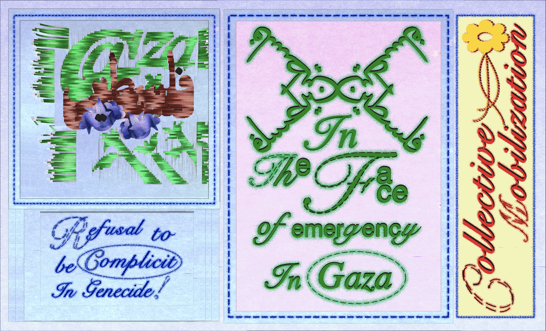
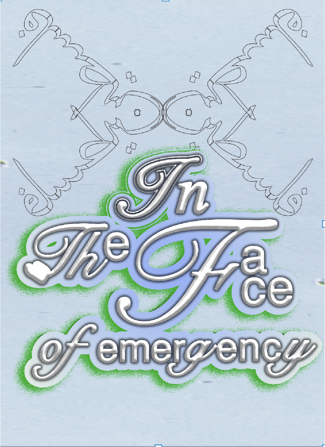
Gaza
Etude and Final
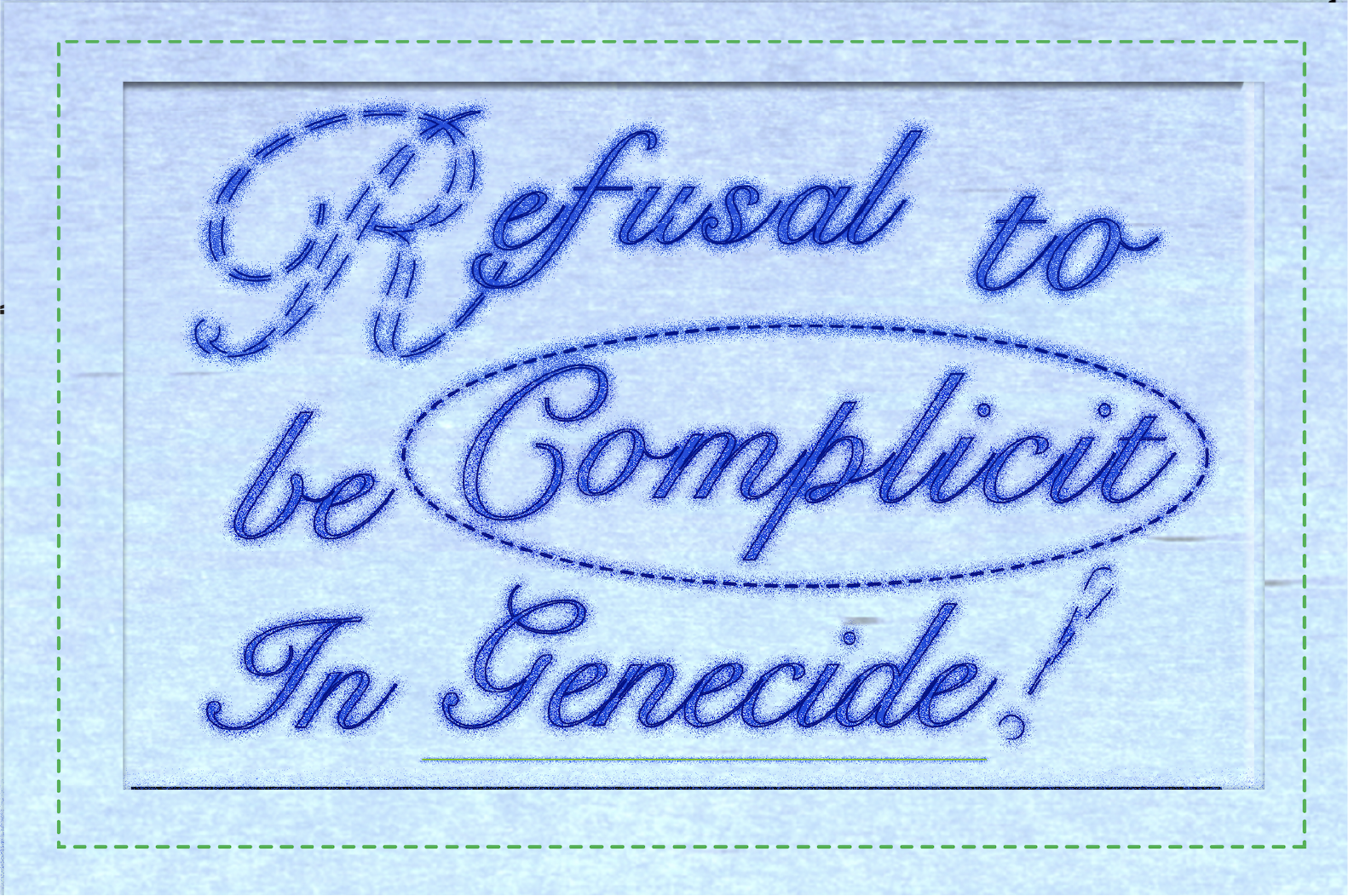
Refuse to be complicit in genecide 2025
This letter is designed in 4 different languages, Spanish, Bask, English and French, and was sent to 4 different organizations as form of resistance
against the atrocities Israel is committing against Palestine.
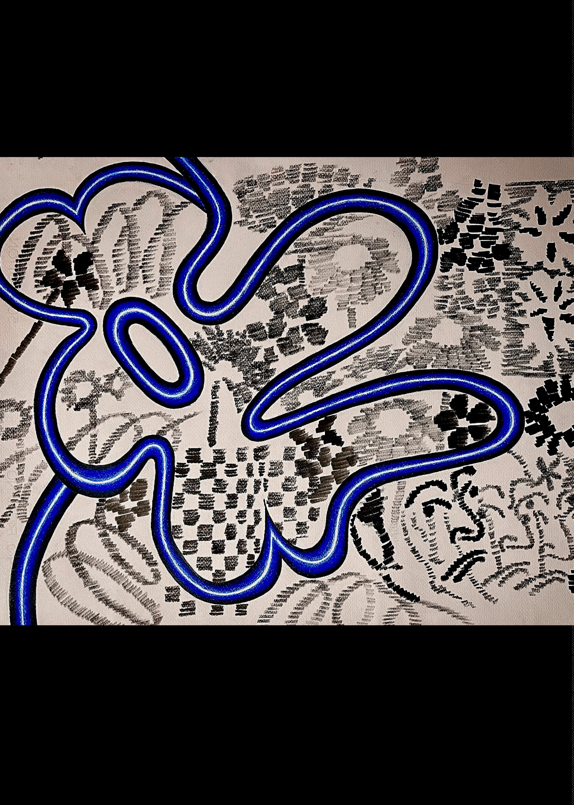
Marker and Colorpencil
Paintings
Fine Arts
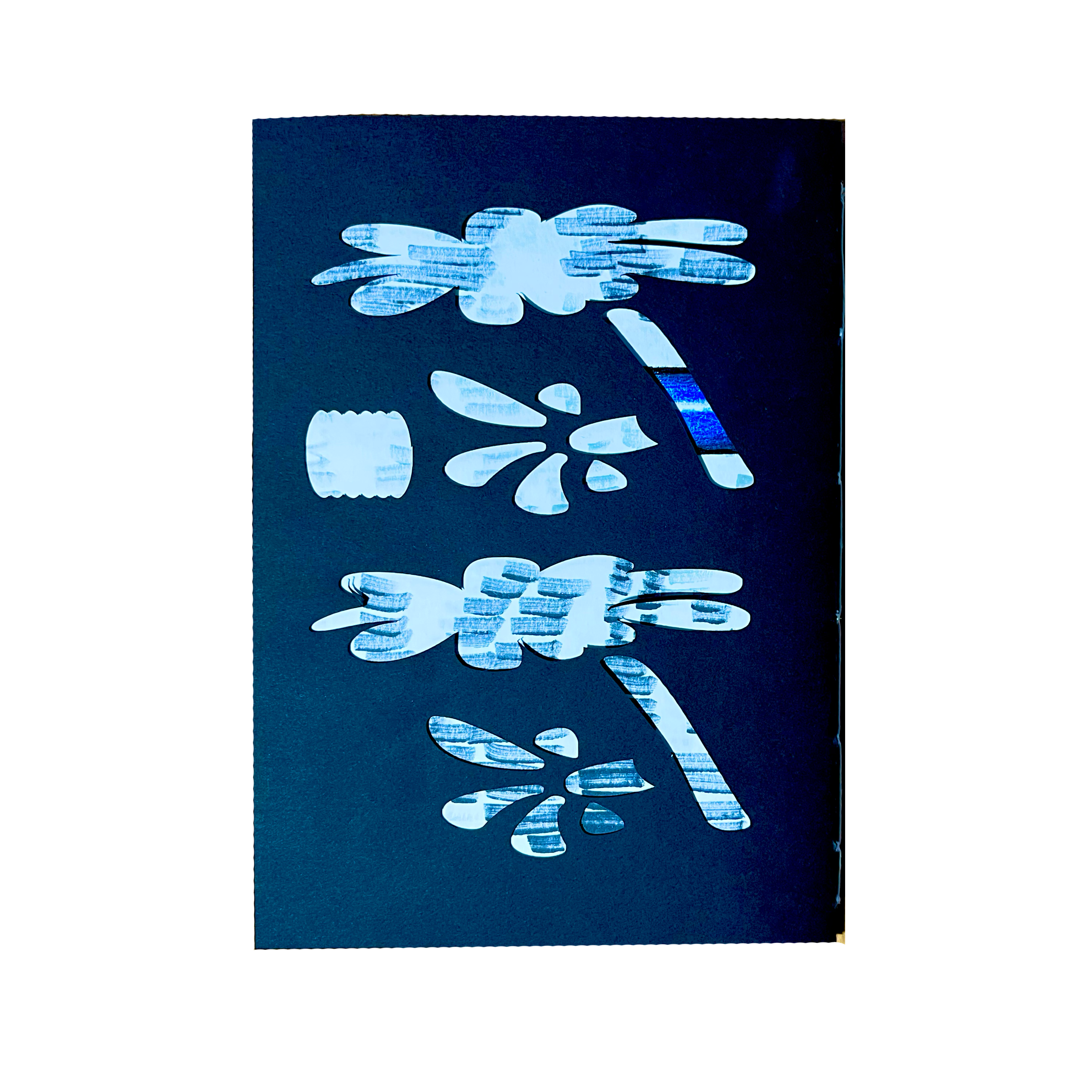
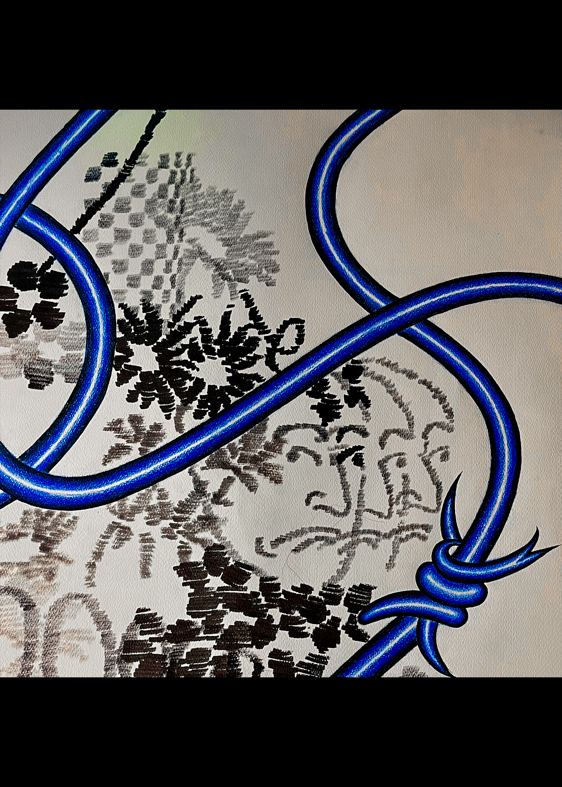
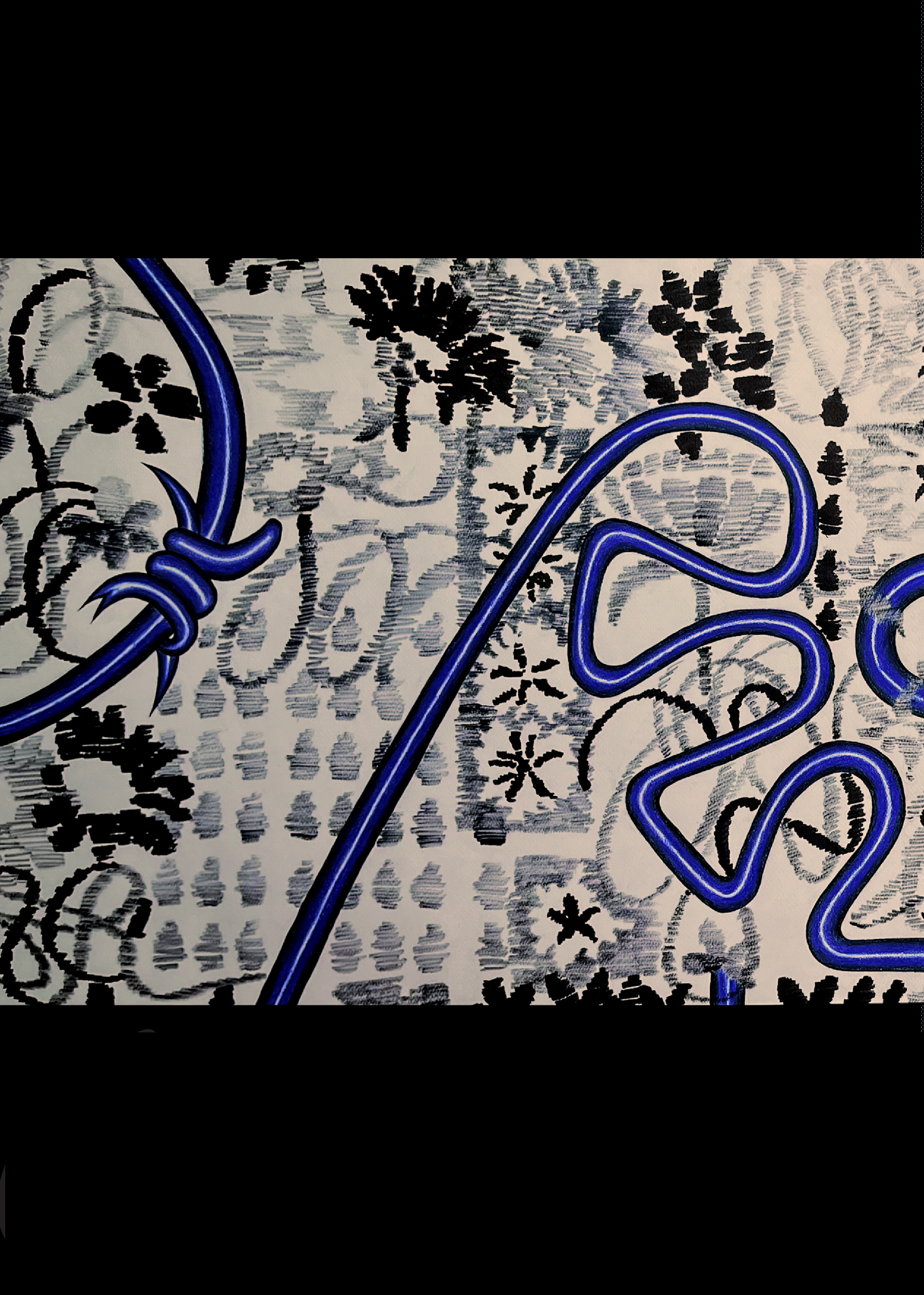
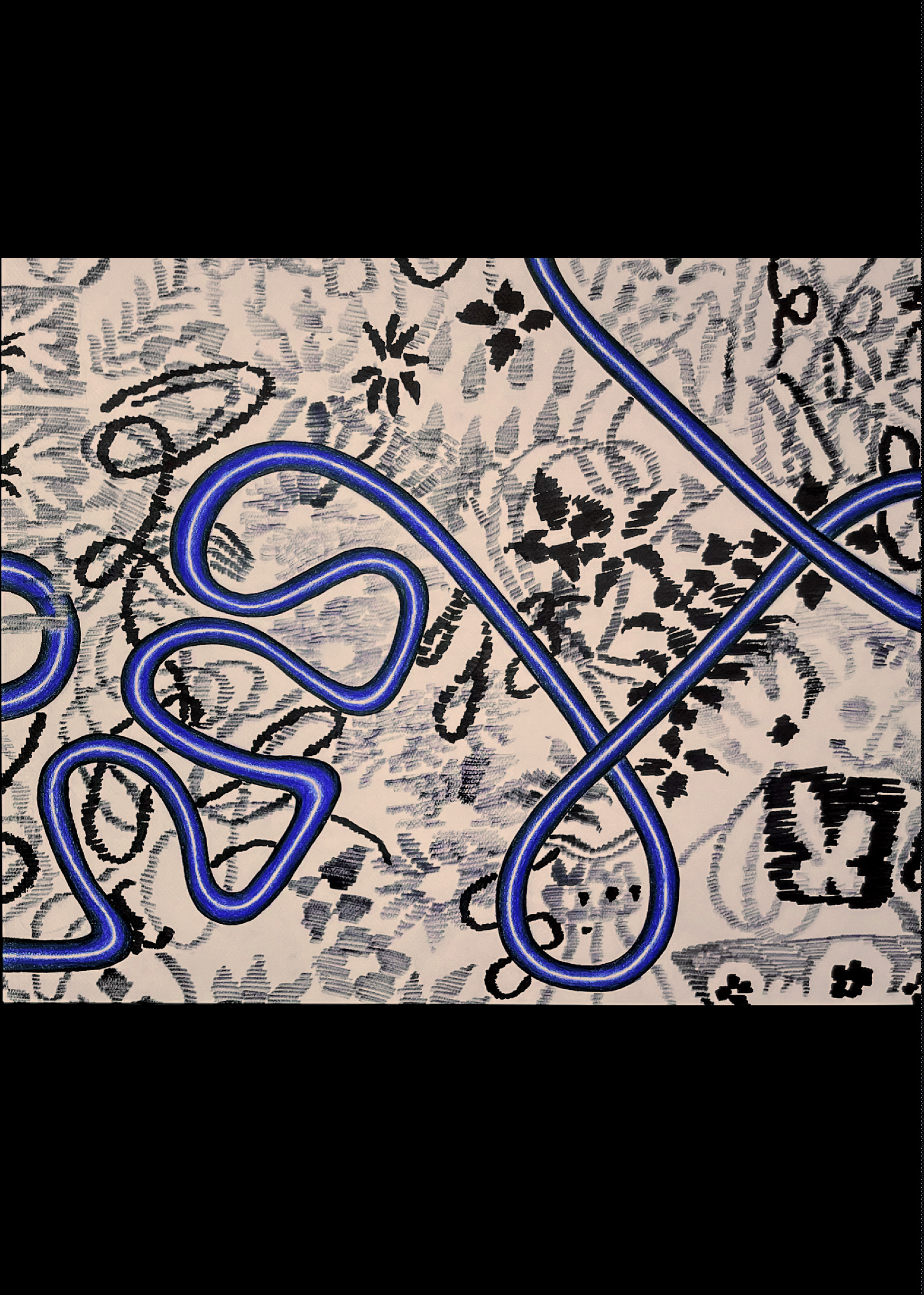
The Grey space in the Middle
From Deja To Vous 2023
From Déjà to Vous is about the intersection of my past life in Iran and my present in the Netherlands. The marker drawings are taken from my personal archive of photographs from Iran and they carry faces patterns and details from the world I left. The blue lines belong to my life now and move across the surface like threads. The two layers never fully merge. They overlap and intersect and at times they are in dialogue and at times in conflict.
This is how it feels to live between two places. The blue line keeps me tied to my past while also leading me toward new directions. I exist in the space between and this work becomes that space where the archive of memory meets the reality of the present.


 Poster